
A high-converting landing page can make or break your paid ad campaigns. You might be spending money on Google Ads, Facebook Ads, or other paid traffic sources, but if your landing page isn’t optimized, you’re leaving money on the table.
Google Ads or Landing Page?
Many still believe that Google Ads is this magical source of conversions. It’s not. It’s just a source of traffic that leads to conversions. However, it’s your landing page that converts users.
Even if your campaigns are perfect, if your landing page sucks, you won’t get any conversions. This is how you can look at things to identify where there might be a problem:
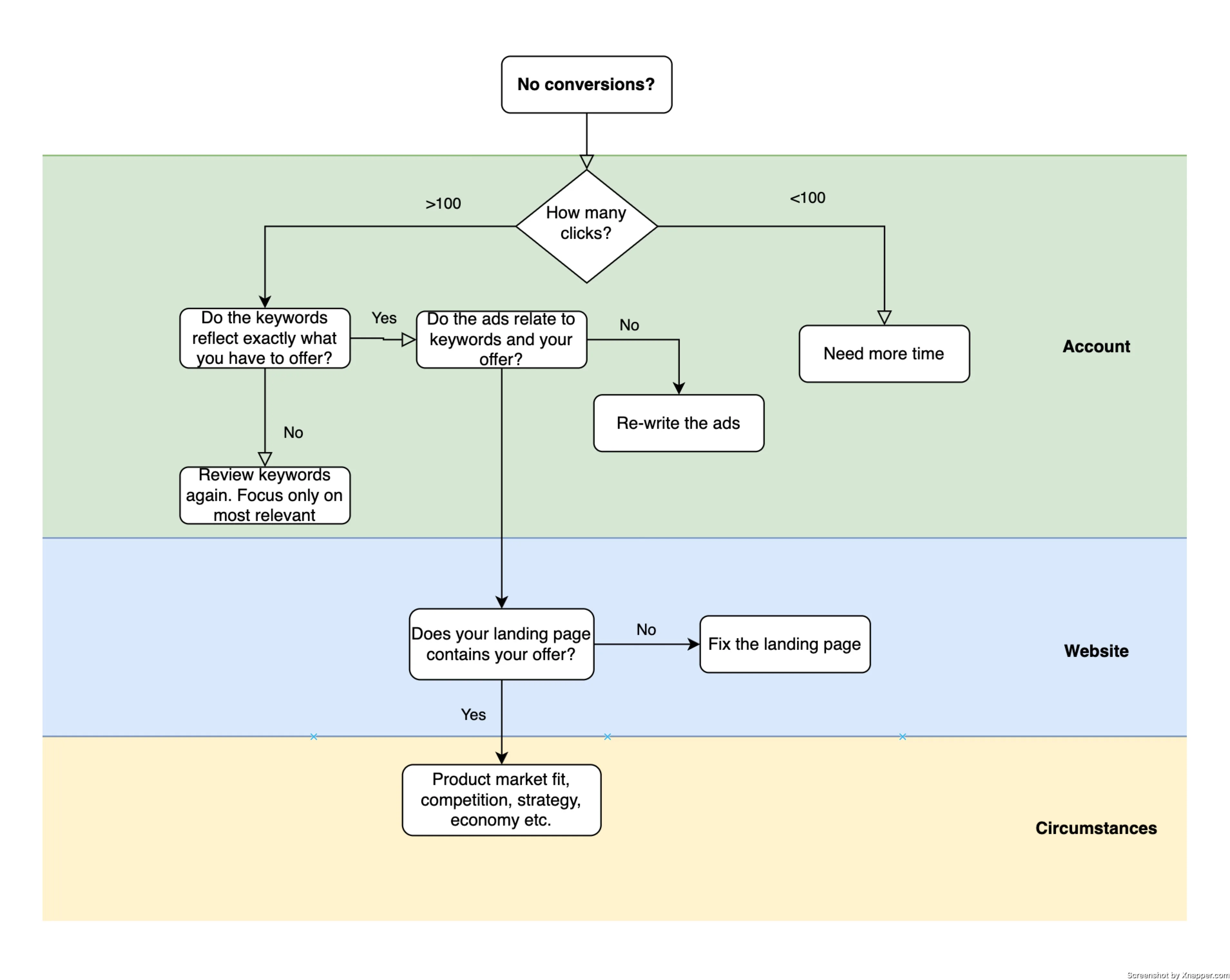
The number of clicks might differ. Use your conversion rate to calculate it. However, what you can do in the Account is limited. If you did everything correctly, and you are driving targeted traffic, then you have to look at the next stage, which is the Website. And it’s in a broad sense. There might be many things that you can fix.
If you fixed that, then maybe it’s something outside your control. This brings us to what I call circumstance. Maybe it’s the market, or your product is just too expensive. Maybe it’s the economy. Or maybe no one needed your service or product in the first place. In this case, nothing will help.
The last stage is where you have the least control. If you are here, you might have to rethink a lot of things. Not only your product but the marketing strategy in general. You can come to the conclusion that maybe Google Ads is not the best channel for what you have to offer. That happens more often than you think.
Let’s focus on the landing page and what you can do to make it convert better.
Slow Loading Speed
Nothing kills conversions faster than a slow website. In fact, studies show that every second of delay can reduce conversions by 7% or more.
Many landing pages are bogged down by large images, unnecessary scripts, and bloated code that makes them load slowly. Visitors expect instant responses, and if they have to wait, they’ll hit the back button before your page even finishes loading.
I know some of the things can only be fixed by the developer, but you’re the one who has to tell them that.
How to fix:
- Use a fast landing page builder (Unbounce, Instapage, Leadpages)
- If you use WordPress, try to use fewer plugins,
- Compress images and use next-gen formats like WebP. There is a plugin for that.
- Enable caching and lazy loading to speed up page rendering. WordPress has a plugin for that as well.
- Fast servers can be a game changer. Don’t save on this one. Get a decent hosting provider and a more expensive plan.
- Minimize unnecessary JavaScript & CSS files. That’s for developers.
You can use Google’s page speed report to find what’s causing slow page load and fix that. It helps a lot. Besides, it also impacts your Quality Score.
No Clear Call-to-Action (CTA)
If your CTA is buried or confusing, visitors won’t take action. Your landing page must make it obvious what you want the visitor to do.
I know you’re thinking that if people came to the page, they would find their way around and eventually buy. No!
No one has time, and if you have competitors, people might just give up and take their money where it’s easier to spend them
Let me ask you: what do you do after you Google for stuff? I open several tabs by using “open in new tab”. And then just quickly go through those tabs, closing the ones that don’t contain what I want. A lot of people do that.
How to fix:
- Use a single, highly visible CTA (not multiple competing buttons). Your main CTA has to be different from any other actions on the site.
- Make it action-driven (“Get Your Free Trial” instead of “Submit”). Remember, no one likes to submit. So don’t use that as a CTA.
- Use contrasting colors so the CTA stands out. It’s not about if green is better than red. It is the contrast of the button. It has to be clearly visible.
- Place CTAs above the fold and repeat strategically down the page. With longer pages, you have to add more CTAs.
Too Much (or Too Little) Information
If your page has too much text, people get overwhelmed. If it has too little, they won’t trust you. The key is to find the balance. It’s not an easy thing to do.
I usually try to understand how much information people need to make the next step. And that usually depends on the product. If the product is expensive, most likely, people will need more information, guarantees, and social proof to commit.
Overloading people with a lot of information leads to confusion and unnecessary cognitive load.
Signs You Have Too Much Info:
- Large blocks of text with no breaks
- Overloading visitors with product details instead of focusing on benefits
- No clear hierarchy (everything looks equally important)
Signs You Have Too Little Info:
- No clear explanation of your product/service’s value
- No social proof (testimonials, case studies, ratings)
- No reassurance (e.g., money-back guarantee, security badges)
How to fix:
- Highlight benefits over features (tell people what they’ll gain).
- Use bullet points instead of big blocks of text.
- Include social proof (testimonials, logos, case studies).
- Use a clear, scannable layout with strong headlines.
Not Mobile-Friendly
Most websites are mobile-optimized. This means they open on mobile devices, and everything looks great. But not all are mobile-friendly. Let me show you what I mean.
Here’s a landing page of a PR agency that I clicked from the ad. You can check for yourself, here’s a link. But this is what I see:
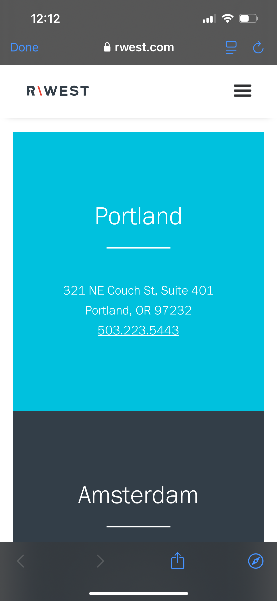
It works, I can see the information clearly. But I only see two offices, and I have to scroll down to see the third. Also, the form, which is the main thing, is below the fold at the bottom.
Now imagine a busy CEO searching for a PR agency. He clicks on the ad, sees these two cities, and just leaves. You can’t afford that.
More than 50% of web traffic comes from mobile. If your landing page isn’t optimized for smartphones, you’re losing conversions.
How to fix:
- Basics: use a mobile-responsive design (test it on different devices).
- Basics: make buttons easy to click (no tiny text links).
- Avoid long drop-downs
- Ensure forms are short and simple—avoid unnecessary fields. You can have a different form on the mobile version.
- Test mobile speed separately using Google’s Mobile-Friendly Test.
- Advanced: rethink mobile design. Use a mobile-first approach.
Asking for Too Much, Too Soon
If your landing page requires users to fill out long forms or commit too early, they’ll bounce before converting.
Think about this as an exchange. The more you ask, the more you have to give.
For example, if you have an ebook or a template and you only ask for an email. Then, the exchange seems fair. However, if you ask to fill a 10-field form with more personal data, then it won’t look like a fair exchange, and people will drop out.
If you need a person to do more things on the site, use the Commitment and consistency principle, which says that people strive to act in ways that are consistent with their past actions, statements, and commitments.
Once someone makes a small initial commitment, they are more likely to continue behaving consistently with that choice. Marketers and advertisers use this principle to increase conversions, build brand loyalty, and improve customer retention.
Ask just for an email. And then slowly ask for more information over a period of time.
How to fix:
- Reduce the number of form fields (ask only for what’s necessary).
- Use multi-step forms (break it down into easy steps). One of the ways to use the Commitment and consistency principle
- Offer a low-commitment option (free trial, free download, or demo).
- Add a progress bar to make long forms feel less daunting. People like to know how much they have to commit.
The list is basically endless, but these five I see quite often. And they are not that hard to fix. Most of them can be done by a single marketer. Some of them will need your developer. this is where you bring all your persuasion charm;)

Blogging gives me a chance to share my extensive experience with Google Ads. I hope you will find my posts useful. I try to write once a week, and you’re welcome to join my newsletter. Or we can connect on LinkedIn.
