

Many believe that if you select good keywords write perfect ads, and have a good account structure, then your success is just around the corner. This is wrong. And I will tell you why.
Google Ads, just like any other ads platform is just that, an ads platform. It’s where you get traffic to your site. Sure, there are things you can do to improve that traffic. Each platform has its approach and you need to know that otherwise, you might not get the relevant traffic you want.
I don’t think we should be using the word “relevant” at all. I mean, do you want, the traffic that is not relevant to your business? Obviously, you work on your targeting (or bidding, assets, etc.) in any ad platform. I don’t want to simplify that.
But once the ad has been clicked, Google Ads has done its job. That’s it. It’s now your website that has to convince the user to convert. And many overlook this.
Your landing page is the key here. With a good converting landing page even a crappy campaign, can bring good results. But a campaign with a crappy landing page most likely will fail.
Let’s look at and dissect landing pages that are being used in Google Ads, so you know what to avoid and what to implement.
Note! Since I don’t have data on how these pages are performing all the suggestions have to be taken with a grain of salt. I’m basing everything on my experience testing and improving conversions on Google Ads landing pages. Test > Learn > Iterate > Improve.
Travel Insurance landing pages
When searching for anything users will not just look at one offer. They will click several ads, that’s just a fact. If they clicked yours, great. But did they stay?
Users have to understand immediately that they came to the right place. If they have to spend time figuring out that, then it’s a bigger cognitive load and that might decrease conversions. Cognitive load is people’s working memory. When things get complex it overloads and people try to avoid it.
Let’s look at “travel insurance“. This is what I get in Google Search.

Travelinsurance.com
I clicked on two highlighted ads. The first one is the Travelinsurance.com landing page.

What I like:
- the headline says it all. I know I’m in the right place
- I see some social proof in the “featured in” section
- Additionally, there are security and rating logos
- everything, including the form, is above the fold
What can be improved:
- the text with the headline is on a transparent background, which makes it a bit harder to read. Especially for older people.
- The “featured in” section kind of blends with the text. I would make it a lot more prominent.
- the form seems too long and complicated. I assume all this information is needed to give a quote. I would test dividing this form in two steps. First, ask the easies information, like where are you going and how many people. And in the next step ask for additional information. This way user won’t feel overwhelmed it might be more likely to continue. But this needs to be tested!
Dan.org
The other ad I clicked brought me here, Dan.org

What I like:
- honestly, not a lot. Except for the nice pictures.
- Not using the home page as a landing page. They have a separate landing page for campaigns.
What can be improved:
- First of all, I don’t get it instantly if it’s about insurance at all. There is a text above Florida, but it’s on the image and barely visible. Why the destination is so important but not what I came for “travel insurance”?
- I am also, not sure why there is a carousel of images with different countries, states etc. They keep rotating and what if I’m not going to Florida? Looks nice, but doesn’t bring any additional value, might be more confusing than helpful.
- There are two calls to action, and this is by itself a big mistake. Especially for Google Ads campaigns.
- Since the images change the CTA (call to action) on some images is not that visible. You can visit the link and check it.
- The second CTA “Annual Travel Quote”, is it about insurance or something else? I would assume this is probably two products, you either buy trip insurance or annual insurance. If you travel a lot this might be good.
- Here’s how I would try to sell it. I would use it as an upsell. Offer annual insurance while you are filling out the form, or as an upgrade when you’re done filling the regular insurance quote form. This way you can present the savings and benefits a lot easier.
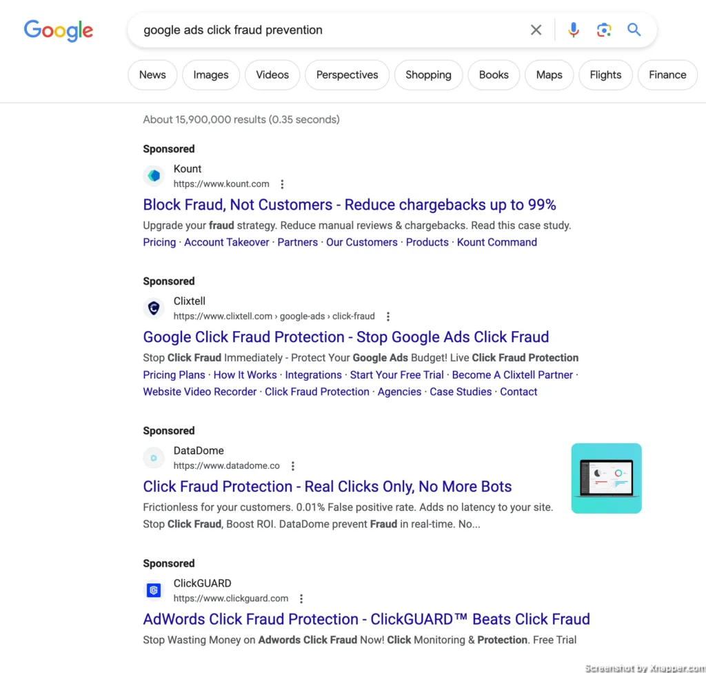
Google Ads click fraud landing pages
Next, I googled “Google ads click fraud prevention”. I decided to look at 4 ads.
Kount.com
First, it’s the Kount.com. Here’s the landing page:

What I like:
- Clean page
- The fact that they offer a case study, is good value. But it’s not as clear.
- They also have a separate landing page for this particular campaign.
What can be improved:
- I’m not sure if they do Google Ads click fraud prevention. There is no mention of that
- If they do, they need to change the title to something like “How Bodybuilding.com reduced click fraud and increased orders with Kount”. This will mention click fraud and also rephrase “order declines” to “increased orders”. I think this sounds better and people love to increase orders more than stop order declines.
- I would make the form title more clear. “Unlock this content” is vague. I know that the main title is on the left, but it would be a lot easier on the brains, if instead of “Unlock this content” would be something like “Get our case study”.
- My laptop is 16 inches, and the main CTA, albeit visible, could be a bit higher.
- There is nothing more on this page. I know they are trying to get leads, but I would have added more details about what is in the case study. How getting the case study can help your business. Even adding features and benefits of Knout. I do hope, they tested it.
Clixtell.com
Moving on to Clixtell.com. This is what I saw after the click.

What I like:
- The title: nice and clear
- The subtitle explains it even better
- Clear CTA
- Even an animated image is kinda cool. It explains a rather complicated topic in a simple animation.
- Secondary CTA is also present if you need to know how things work
- There are some reviews, Trustpilot logo, which is great.
- Separate landing page for this campaign
What can be improved:
- The secondary CTA “How it works” directs to features and not to an explanation. I was hoping to see a video or something that explains things in more detail.
- Lower on the page there are Bing and Google Ads logos, that they support. This is great, but I think it might be better to have them above the fold. I did google “Google ads click fraud prevention”, so having the Google Ads logo visible would be a lot better.
Then there are steps after you click the main CTA. I think they are worth going over. This is how they look:

What I like:
- It shows how many steps there are. This is important in setting expectations
- In the first step, I like the name of the website field “Website URL to Protect”, which communicates benefits.
What can be improved:
- I would probably leave the password in the last step. Focus on getting an email and a website, for those follow-up emails, if the users drop out.
- The second step shows the plan and you can change it. But when you click to change you get this pop-up, which is way too confusing. Also, the mobile version of that pop-up does not work well. In general, this step can be improved with a better visual of the plan I’m currently subscribing to and additional plans. It would be also interesting to remove this step, subscribe the user to a general plan, and offer upgrades later. This will remove additional friction and shorten the steps by 33%.
- The last step is fine, but the CTA is Create an account, but it should mention Free trial, so “Create an account and start trial” or just a shorter one “Start a free trial”.
Datadome.co
A third landing page is Datadome.co. This one is interesting as they had this “prove you’re human” thing.
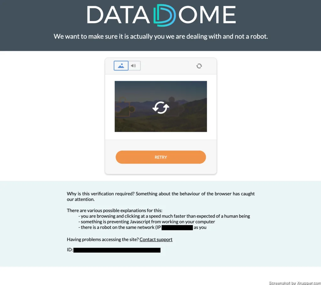
I was using a VPN to browse from the USA, they could have detected that. Anyway, here’s the landing page:

What I like:
- The title is OK, not a 100% match to what I searched, but I get that I’m in the right place.
- The form looks short and simple, but…
- They have some nice explanations below the fold. I would probably have a secondary CTA so that the user could explore the page.
- It also seems they have strong social proof, both in the companies they work for and in various rewards.
What can be improved:
- Not sure if this is the place to ask “Where did you hear about us”. It’s not something a user needs, it’s just for the company marketing department. This information could be obtained during or after the demo.
- I wonder what answers they get for the question “the attacks and problems you’re facing”. If possible I would do a drop down here. I’m sure the problems can be categorized.
- Not a fan of the last benefit check “Not ready for a Full demo? Take a virtual Tour first!”. Where is the CTA for the tour? And this is not a benefit, at least does not belong here with the first two. Add it lower as a secondary CTA.
Extra “bonus”. Do you think the icon choice in the “Ad fraud hurts your business” section is good? It kinda looks that the “real” images were not loaded properly. Avoid using icons, that have another meaning, to which most of the internet is used to.

ClickGuard.com
And the last landing page is Clickguard.com.

What I like:
- I like the design, although this is subjective, but it looks modern.
- The CTA is very clear and visible
- I see rantings above the title, which creates social proof.
- The website in general is nicely done. I love the features blocks, explanations, and visualization.
- I also like, that they have Customer stories. I think they can be higher up. They are almost at the bottom of the page, but these case studies are great social proof.
- When you scroll down, the top menu follows you (sticky menu), but what’s interesting is the main CTA becomes “Free demo” it even changes the color. If this is done on a hypothesis that people who scroll are not ready to start a trial and would be more interested in the demo, then it’s very smart.
What can be improved:
- The title can be clearer. It sort of mentioned the benefit (clean, better traffic). But is it suitable for click fraud or Google Ads? This might be because they use the home page for campaigns. If they had created a copy of this page and changed the title to fit the campaign, that would have been perfect.
- The subtitle is a bit too small and also kind of hard to read. I would formulate it differently “Boost your ROI with clean traffic. Outsmart competition” or something to that extent.
- The graph looks nice, but that’s about it. It’s hard to understand what should I get out of this. I would focus on showing the outcome. For example, show 3500 clicks, 30% prevented as fraud, and then savings because of that.
- The CTAs “Get protected” and “Start a free trial” lead to the same page. I would use the same name as well. Especially, if the top menu is sticky, follows me when I scroll. Consistency is important.
Let’s explore the “free demo” page.

What I like:
- The awards. Nice!
- The form is clean and easy to understand, they are not asking for too much information
- The logos in the question about platforms. Makes it easier to answer, hence faster. Less resistance.
What can be improved:
- The time zone can be detected automatically. And then offer the possibility to change. Do a lot of people know their time zone?
- Check the first sentence below the title. I would use this as a title “Saved over $1 billion for more than 5000 clients”. It Says a lot more than “Unleash your campaign’s potential”. They could even make it shorter “Saved over $1 billion”, that’s a strong statement.
- There is too much text on the left. I would make a strong title and then write a sentence or two. Also, make the font bigger. Now it’s a bit harder to read and the text is on a dark background. You don’t want the user focusing too much on the left when his attention should be filling out the form.
AB testing for small websites
The final search query was “ab testing for small websites”. I wanted to see if there is testing software that focuses on small to medium businesses.
Omnitail.com
Omnitail.com is not exactly a software, but this is why I included them. They provide CRO (conversion rate optimization) services. Also, they’re ad was very attractive “We will increase Conversion – or you don’t pay”.
I’m curious how this traffic converts, as this is not what I’m looking for. They are probably bidding on the broad or phrase match keyword “ab testing”. Which can be smart, since people looking for this software probably want to increase conversion rates and revenue.
And since they do CRO, I was curious to see if I could spot anything wrong with the page.

What I like:
- The title is good, it starts with a benefit. The subtitle repeats the offer they had in the Search ad, which is also good.
- I like the “risk-free” phrase in the CTA. But there is a but…
- The form is OK, I’m sure they tested it out. I guess, we could question the last name requirement. But this can increase the commitment of the user.
- There are some reviews of their clients, which is always good
What can be improved:
- I’m surprised they use a CTA named “Submit”. CRO experts have this opinion that is not the best name. I mean, no one likes to submit, right? Well, some people like it, but this is a bit of a different topic (lol).
- Not sure about this reCaptcha being so prominent. It is a lot more visible than their CTA. I hope they have a reason for it.
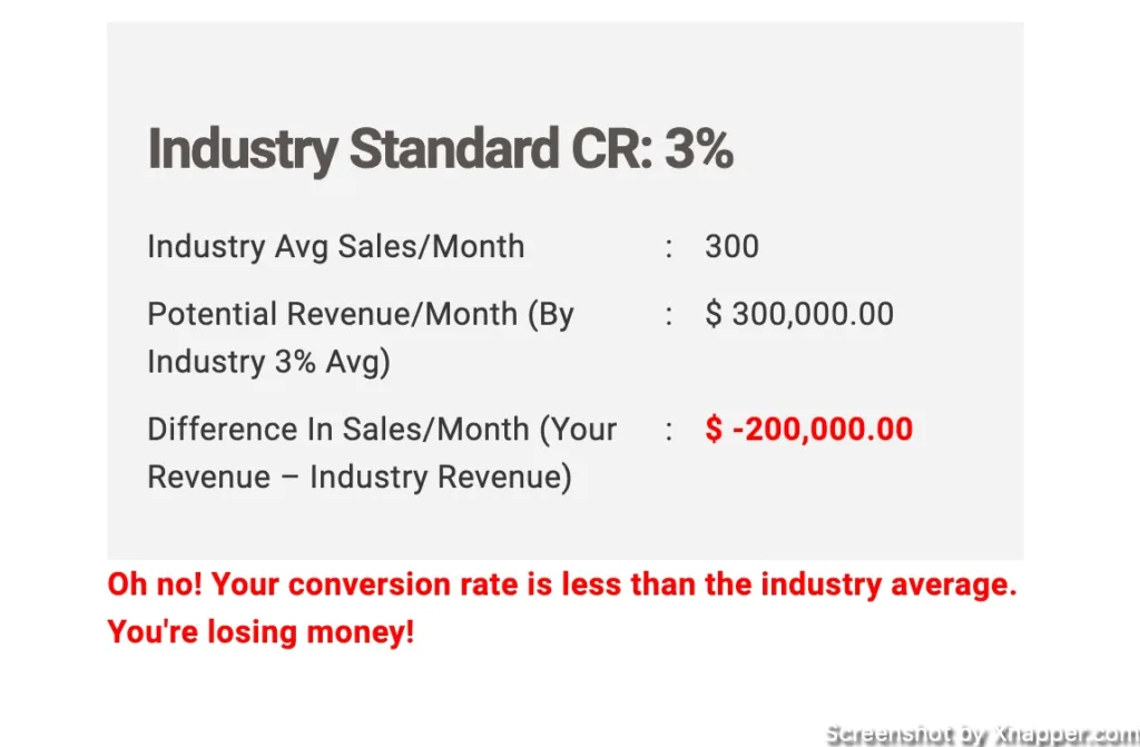
- I think the CTA can be better, even though I said I like the “risk-free” phrase. But it’s a great phrase. Let’s examine, the CTA says “Start risk-free”, which points to a form, which is an ordinary form, and then a submit button. Is there a risk here? Since they have this money-back offer, I would probably lead with a stronger CTA. For example, on the left, it can say “Find out how much we can increase your sales”, then filling out the form becomes a logical next step. And use a CTA “Get my personalized offer” or something similar. It’s not ideal, but it kinda makes things personal and it might help get the sale because in the offer you might calculate some of the possible earnings through optimization.
- They can go a step further and create a small calculator that can show potential savings or revenue increases. Similar to the image below:
Monetate.com
The first landing page with the video, Monetate.com.

What I like:
- Video with a person looks warmer, and more personal than just a cold brand.
- They have a separate landing page for a paid campaign.
- They have a nice features section
- Logos of the companies they work for
- They also have a playbook, as I understand this is an ebook with personalization examples. Maybe it should be their main CTA? Or at least placed higher than it is now.
What can be improved:
- I don’t see the CTA which is below the fold, well at least my fold. Same on mobile devices. Unless the video itself is the main CTA, then it’s fine.
- The title. As you can see no mention of AB testing or small websites. Probably the landing page is not for AB testing, they just bid on the keyword.
- They have a separate page, which is great, but look just below the logo – a breadcrumb (you can see where you are on the page). They named the page “Features Long Form Landing page”, this tells me that the name is not supposed to be visible, but they forgot about the breadcrumbs on their website.
- When you play the video it would be nice to know who this guy is. Is he a customer? Is he the owner or CEO? This can add credibility.
Since the video is key here and the CTA leads to a form, why not have them both present on the landing page above the fold? They might have tested that. But to me it makes sense. You watch the video and can fill out the form while doing it. No additional clicks. You can also point in the video to “fill out the form on your right”.

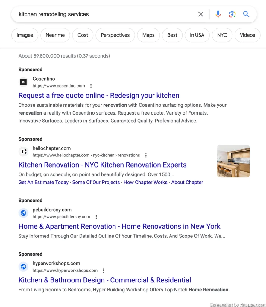
Kitchen remodeling services
The last category I chose is “kitchen remodeling services”. Here are the ads Google showed me.
It’s safe to say no one uses keyword insertion as I don’t see any ads that use remodeling. I checked the search volume and “kitchen remodeling” has 110 000 searches, whereas “kitchen redesign” only 510 searches. All of the companies need to update their Search ads.
Cosentino.com
We’ll start with Cosentino.com.
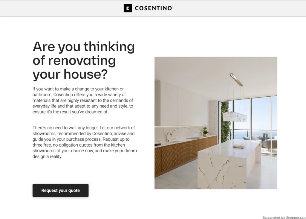
What I like:
- The kitchen picture
- The cleanliness of the design.
- There is no menu. This is done to avoid any distractions.
- Separate landing page.
- When you click to request a quote it scrolls down and you have this selection of what you want. I think this is great, but this could be above the fold.
What can be improved:
- The title talks about the house, I’m interested in the kitchen. Which is weird, since most of the content further talks about the kitchen.
- There is not a lot of information on the page. So they could just focus on the quote form, which comes in the form of a survey of some sort. You have to answer several questions and leave your details at the end.
- Since there is not a lot of information I would probably make the logo clickable and link to a home page. Which looks very nice, by the way.
Hellochapter.com
Next, we have Hellochapter.com.
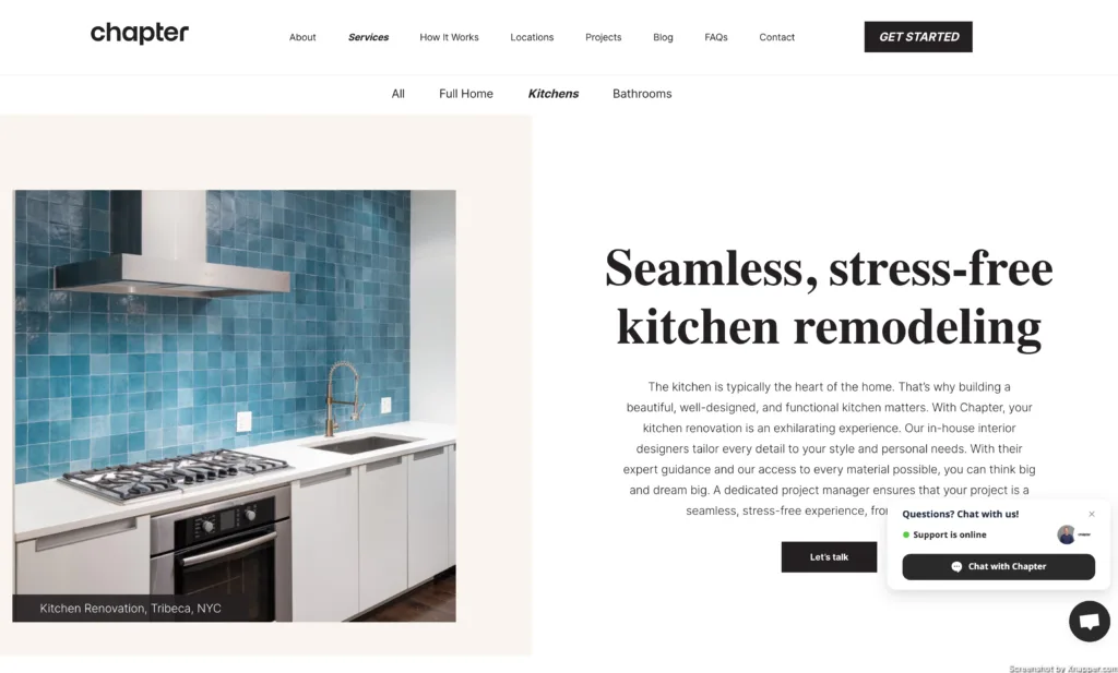
What I like:
- The title talks about kitchen remodeling. Great!
- I like the “stress-free” part as well. I’m sure there is a lot of stress in remodeling.
What can be improved:
- The kitchen picture can be better. I mean, is that the best picture they have to represent what you do? What about the before/after picture? Works well.
- Main CTA and chatbot CTA. I hate it when this happens. At least here you can click on either of them. There are websites where the chat pop-up covers the main CTA.
- In the TOP menu, there is another CTA “Get Started”, and the link is not the same as with “Let’s talk”. Way too many menu options.
- If you have a chat, then personalize it. Make it “Chat with Daniel”.
- Then we click on the “Let’s talk” CTA, image below:
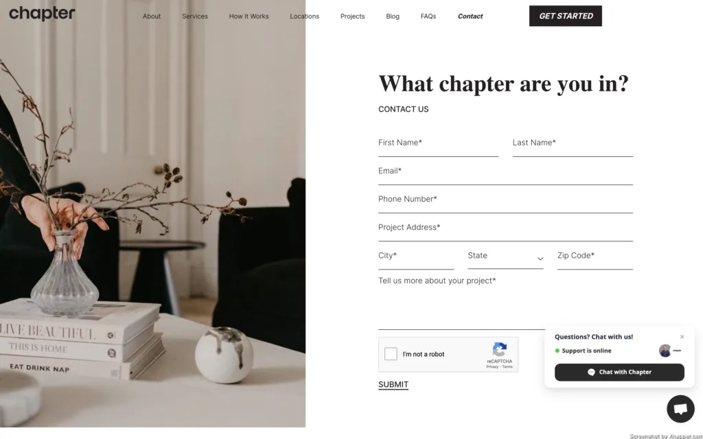
What can be improved:
- The headline is not good. What is a chapter? What do you mean? Like, in life? Is the chapter like a room (like a kitchen)? They can just remove the title and that’s it.
- Chatbot again? Do you really need it on this page where I’m actually saying to you that I want to contact you?
- The size of the CTA. It’s barely visible.
- Submit? Really?
Hyperworkshops.com
To be honest, I’m not sure Hyperworkshops.com is into remodeling. This is their home page, I would have left almost immediately.

What I like:
- Nice pictures
- In general starting with projects is OK as you can see what the company is capable of. But not when you click on the ad that is about kitchen remodeling.
What can be improved:
- No title, no idea what they do at all. Design? Training (workshop in the name)?
- Nothing about the kitchen or remodeling.
- No CTA of any kind.
- Most likely bidding on the wrong keyword(s).
Also:

When creative is too creative. Please don’t do this, unless you’re 100% sure people get it.
Final thoughts
As you can see there are plenty of companies who might be losing out on possible conversions, because of poor landing pages. I don’t see their data, so can’t know for sure if that’s the case, but some of the landing pages are making basic mistakes, that you can learn from.
Usually, you test you test your way through to a good conversion rate. But if you’re starting and you need to create a landing page, best practices work. You need to apply them to your business vertical, and your landing page already will be a lot better.
Otherwise, use this list to come up with hypotheses on your landing pages and test them.
I share weekly tips on how to create, manage, and scale Google Ads campaigns. Subscribe to my free newsletter.
I’m also down with connecting on LinkedIn.
Or follow me on X, for some quick updates and fast insights.
