

Google Looker Studio (formerly known as Google Data Studio) is a free online tool that lets you create beautiful reports and dashboards. Data reporting can be confusing, and to make things worse, you have to know how to present it to others so it is easily digestible.
More often than not, marketers don’t even try to present information to decision-makers in their company or clients they work with. And I get it. It’s just so much stuff there. It is hard to understand what matters and how to get it all in one place.
If you do provide data as a marketer, kudos to you. I just hope you’re not doing everything manually in spreadsheets. And this is another downside as you might have several platforms where you get your information and you need to combine them in one dashboard.
You can use Google Analytics, but let’s face it, the new GA4 is not very freindly for that. You will have problems sharing those reports.
And this is where Looker studio comes in. So Today, lets go through Looker studio and how you can use it to craft awesome Google Ads reports or dashboard for you colleagues or clients.
What is Looker Studio?
To put it in a simple terms it’s a platform which allows you to bring in data from various sources into one place so you can craft your reports. It helps you tell a story with numbers.
It’s fully customizable, so it not only makes it easy to present data but you can brand it with your own colors.
Here’s a small list of what you can do with Looker Studio:
– for data visualization you can use graphics, tables, numbers, lines or bar charts;
– you can filter out what data you want to show and even add the data selector;
– you can add date comparisons (my favorite), so the client can see the differences in data;
– free text to explain certain graphs or ares, or provide your insights;
– add images or video to the report
– connect several sources and combine them in the report.
Here’s one of the templates Google provides for you:
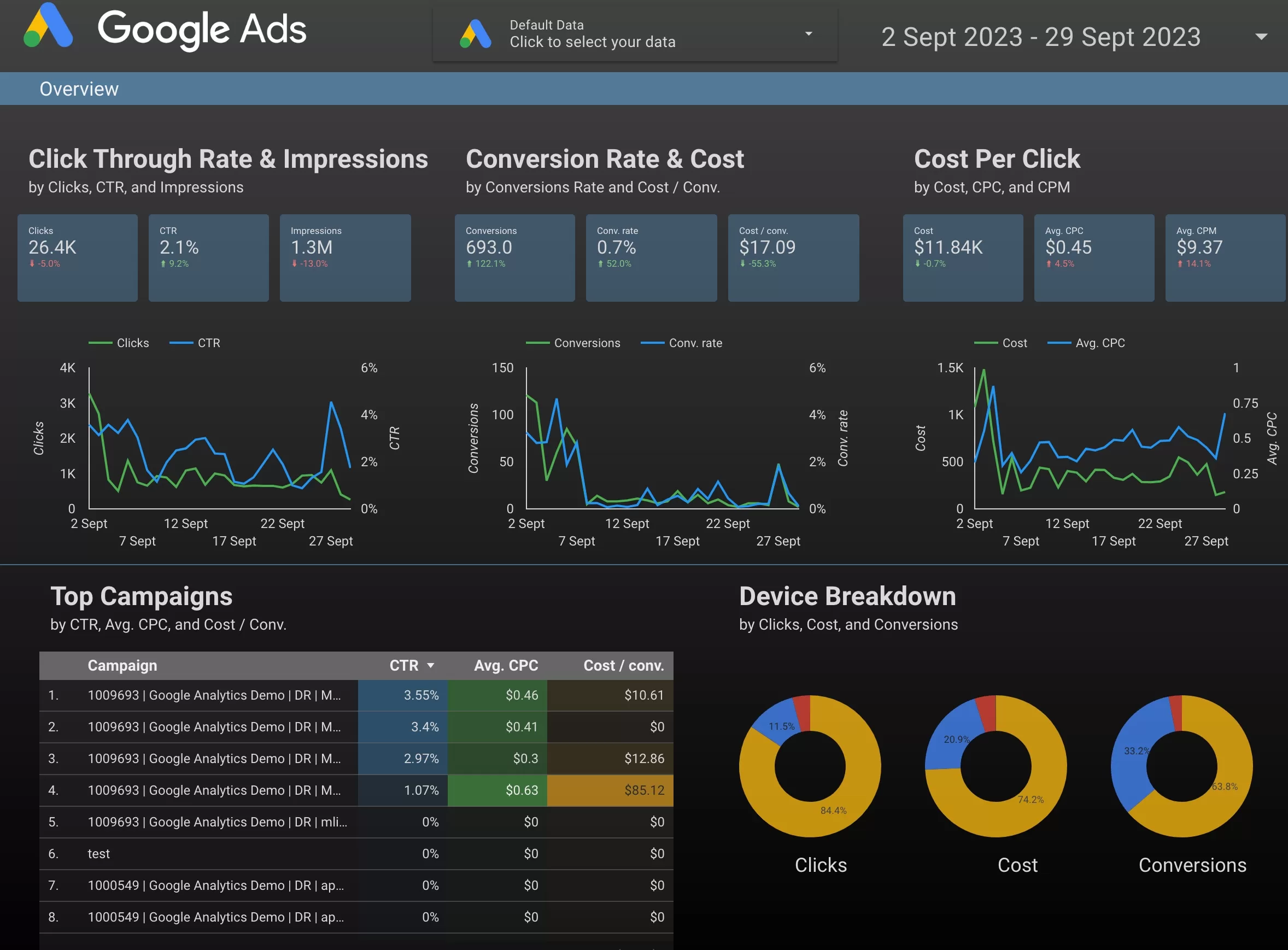
Looks nice, right? Unless your not a fan of dark mode. Fear not, there are several free templates and I will also provide additional sources of where you get get even more templates.
Beyond data what I like about it, that it’s easily shareable. Looker studio gives you a link that you can pass to anyone and all they need is to hit refresh and they see all the new data automatically. You don’t have to add the data again and again and send it to people. Saves a LOT of time.
Another key feature is that you can bring data from various sources. In this post we will be talking mainly about Google Ads, but you can connect your GA4 property and pull numbers from there. Of you can connect your Facebook ad account, even Instagram or YouTube accounts. It has a marketplace of connectors (this is how you connect
data to Looker Studio):
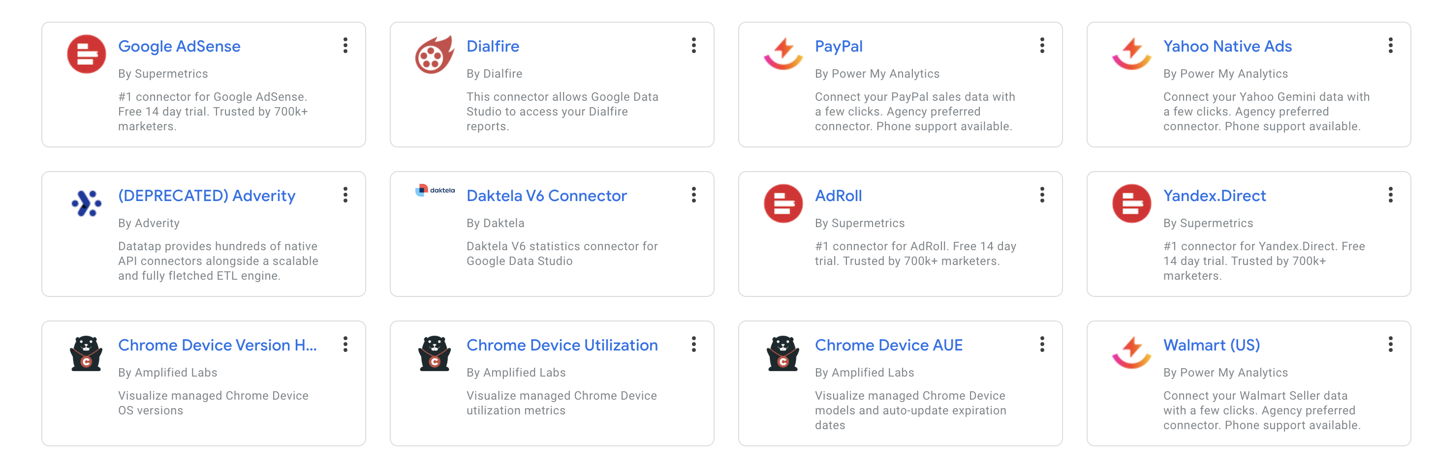
Some of them are free, others will be paid. We will get back to them later in the post. But if you use that data a lot, trust me, it’s worth the money.
OK, now that we know it’s a great tool and it’s free. Let’s see how you can start using it.
How to access Looker Studio?
Head down to lookerstudio.google.com and you will have to log in with your Gmail email. I’m sure you have that. You can use your Google Ads email as well, will be easier to connect it later.
You should see some templates and probably an empty list of reports.

I have a few here. Some of them might be shared with you and will be listed here as well. As you might noticed it’s similar to Google Drive. You see your stuff and stuff people shared with you.
In the top, you will see 3 tabs. The main is Reports, and then you have Data sources and Explorer. Let’s leave the latter for later (tongue twister?) and just focus on Reports and Data sources. With reports it’s easy, you see all the reports you have access to. And data sources will show all the data sources that you have connected to your reports.
Remember, you don’t have to connect the same source several times. Once you connected it, it’s there and you can use it. Only connect new sources.
Usually you connect a data source while creating a report. But you can add a data source in here as well. Just switch to Data sources and click Create on the left, bellow the logo.
I would recommend to take a look at the tutorial Google has created for you. I’m sure I won’t cover everything in this post. Beside, the more information you have the better you will be at creating reports.

You have your Looker account, let’s create your first dashboard.
Building Dashboards and Reports
Starting from a template
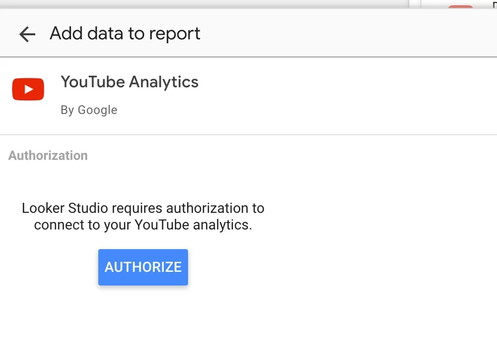
You can start with blank report or choose of the provided templates. We will start with the template as it is easier. Let’s connect YouTube. Select the YouTube channel report. You will be take to report screen:

Change the name so it makes sense to you. Whoever you share it with will also see this name, so make it nice. Then click on the button to Use your own data. This is where you will have to connect your YouTube channel and will have to authorise the access.
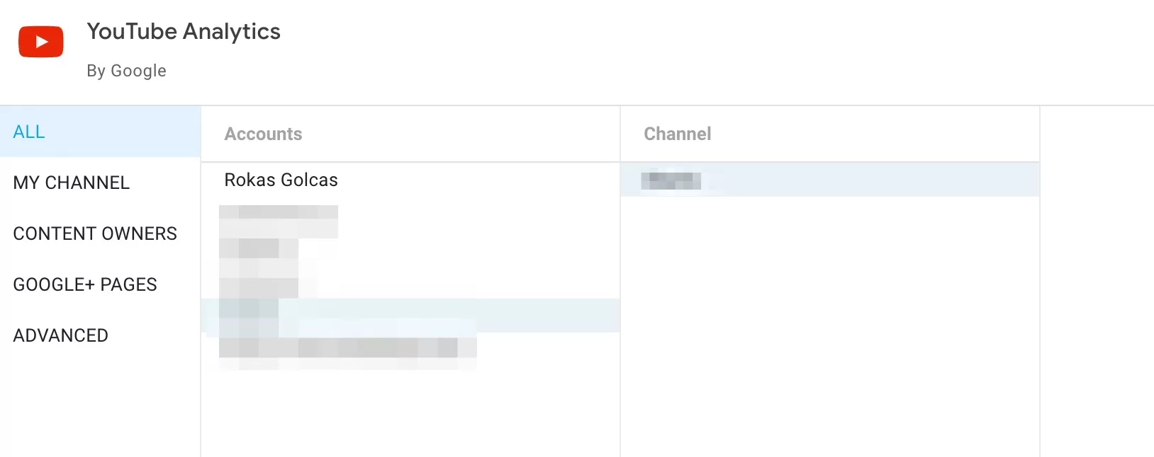
If your email is connect to several YouTube channels you might see a list and will have to select the one you want. Each channel is a different source, so you will have to go. through these steps to connect other channels and accounts.
Once you connected your account, you should see report populate with your data. You can click on Edit and Share blue button on the top right side. But At the time of writing Google shows me an error. Maybe it’s just me. But if it happens for you, just go through the steps again. And then just click on the Looker logo, it will take you to the list where you will see your recently created report.
While in the list click on the report and then click Edit. This is what you should see:

Let’s edit one of the the graphs. Click on the graph and on the right side you will see additional options appear.
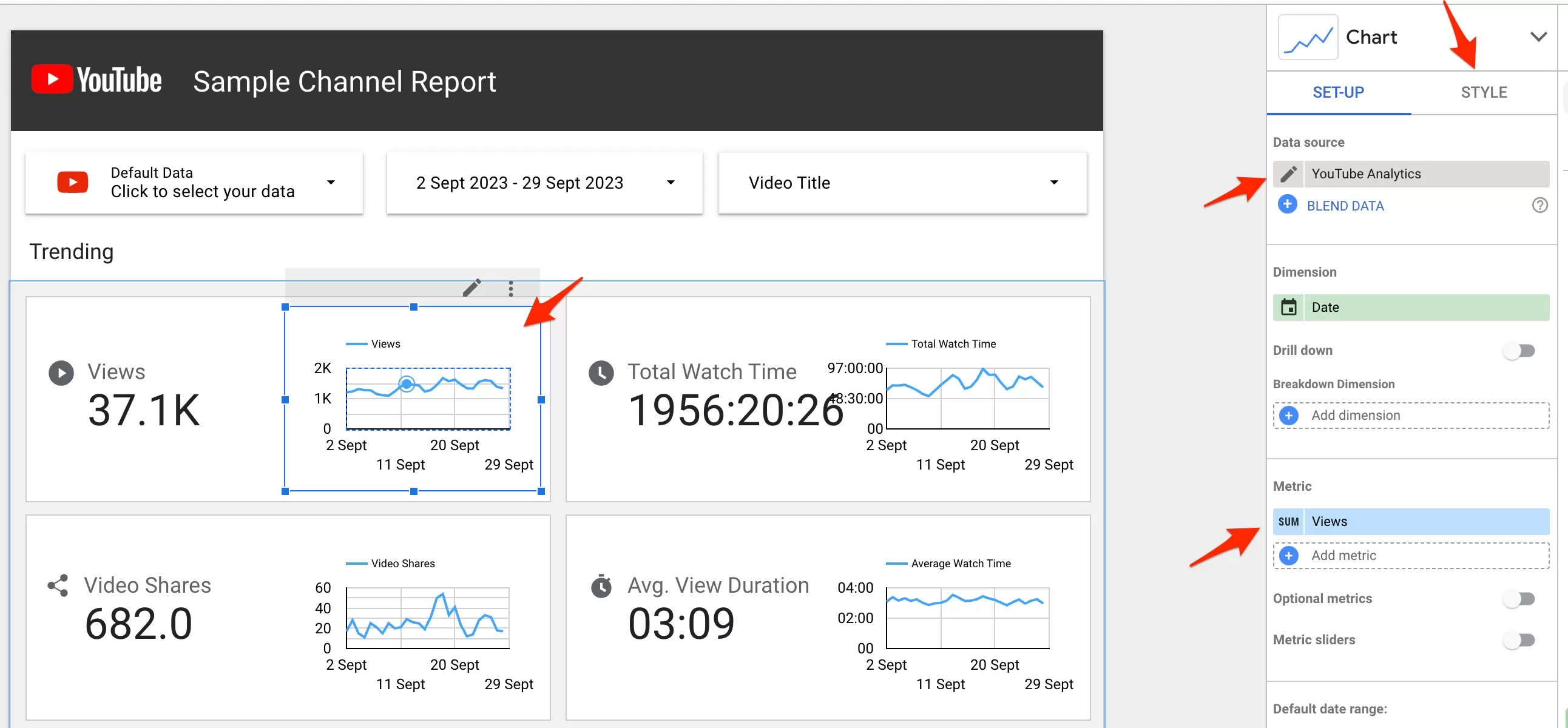
As you can see it shows you a data sources, where this information is coming from. This is important as you might have several graphs, all pulling data from different sources.
Then you see a dimension, which is date at the moment and a metric – Views. You can change that as well. Let’s change views to Average watch time. Click on Views and you will see a drop down of all the metrics. If you know the metric name, just search for it, otherwise scroll down to find it.
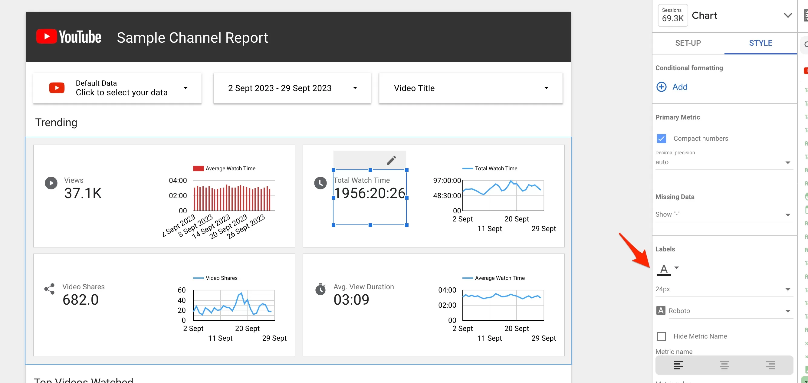
And let’s change the graph from line to bars. For that you will have to click on Style as shown. You will see additional options for the graph along with the color and font size etc. I changed the color of bars to red as well.

The changes happen instantly, you don’t have to save anything. Let’s see how it looks now.

I like red better. I also see that the text size is way too big. Let’s change it. Select the text you want to edit and head over to Style. Look for Labels and change the size to smaller. You can also change the font.
I think it looks better. You can edit this way anything in the report. The options are similar to what you find in Google Sheets, so you should be familiar with the icons and the names. I don’t think we should go into details here.
If you don’t need something from the template, just delete it. Select the element and press delete on your keyboard.
I will show you how to create report from scratch later on. But I found to use template a lot easier and faster. But there are a few things I still want to show you.
Usually you want to add your clients (or companies) logo. So click on Youtube logo in the report. You might want to double click to select an element within an elment. This goes for graphs as well. First you select the whole graph and if you want to select the part it, just click again.
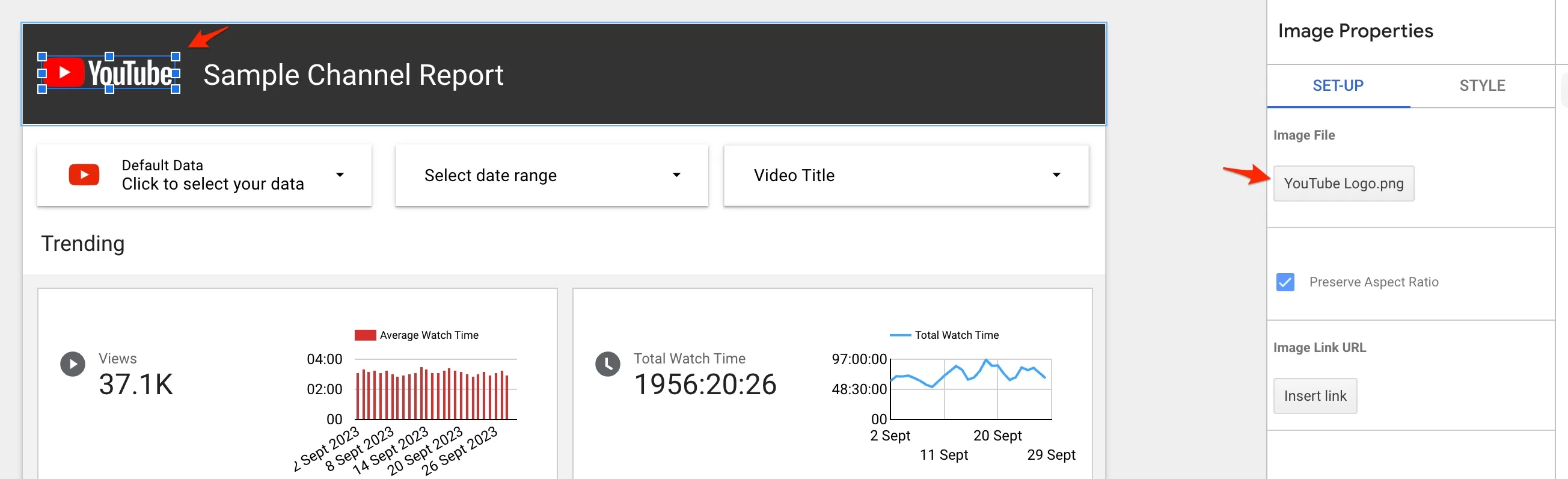
On the right side, click on that button to replace the logo. I will also change the headline text and background. Double click on the text to edit it. And as for the background just click on it to see options on the right.

It will say what kind of an element is it. You might have to click around a few times to select the right element. So after th new logo, some text and background we have a different look:
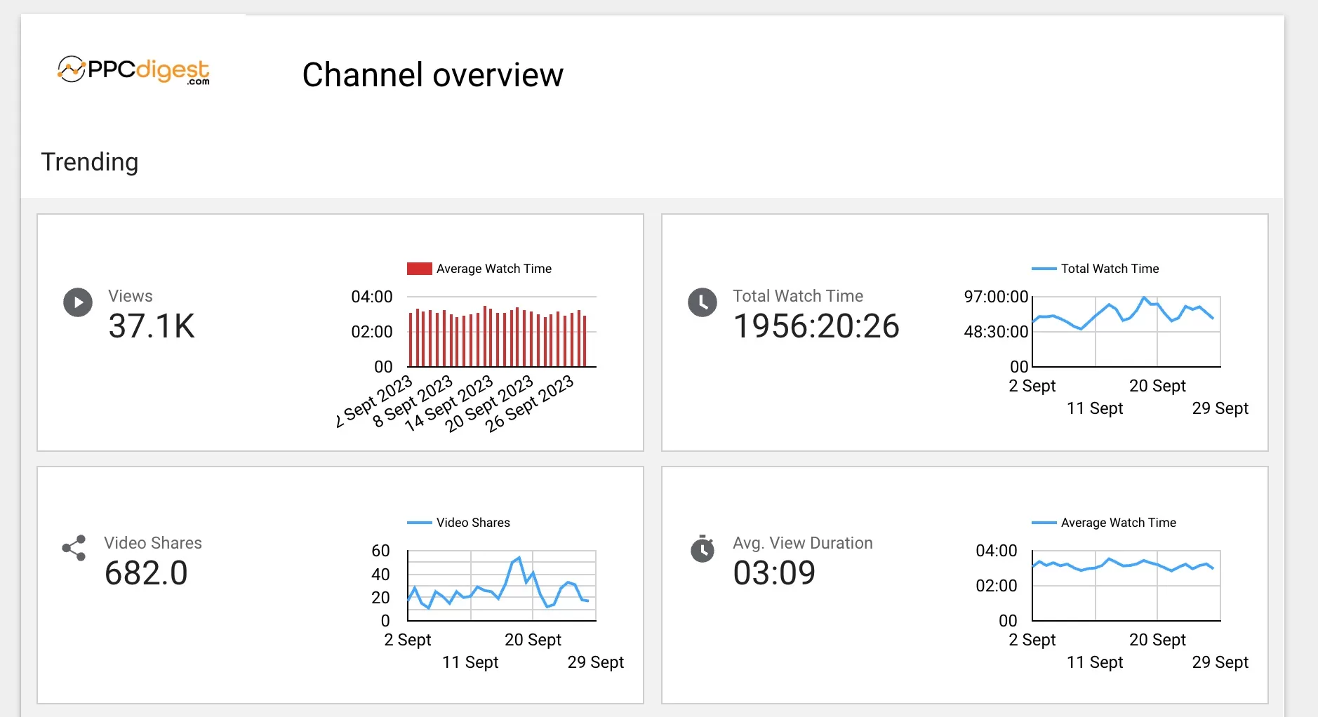
I like the clean look. Obviously this needs more work to look even better. But that took me probably 10 minutes. I would spend an hour or so to make it even more presentable and boom. A report I can share. Once you’re happy with the report click View.
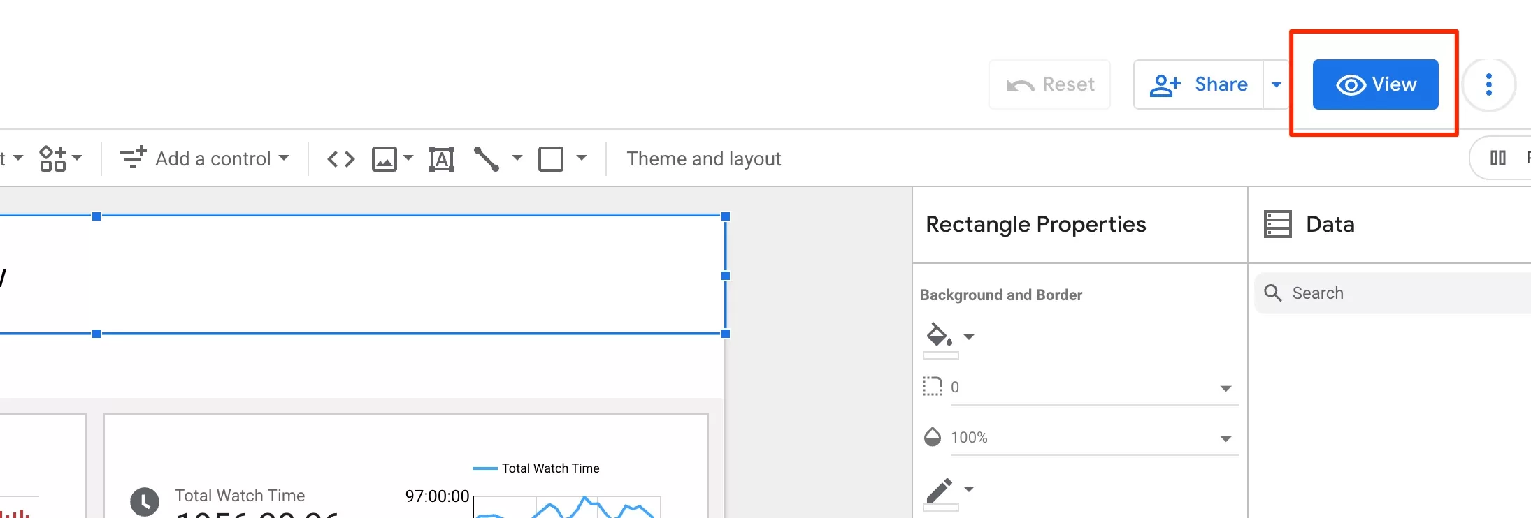
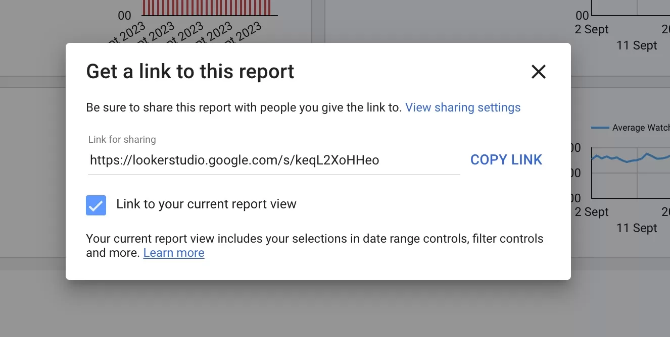
Then you have several options. You can share it by scheduling or getting a link or you can invite people, and even download the report in PDF.

I usually get the link and email to the client. And I don’t have to worry about sending weekly or monthly reports.
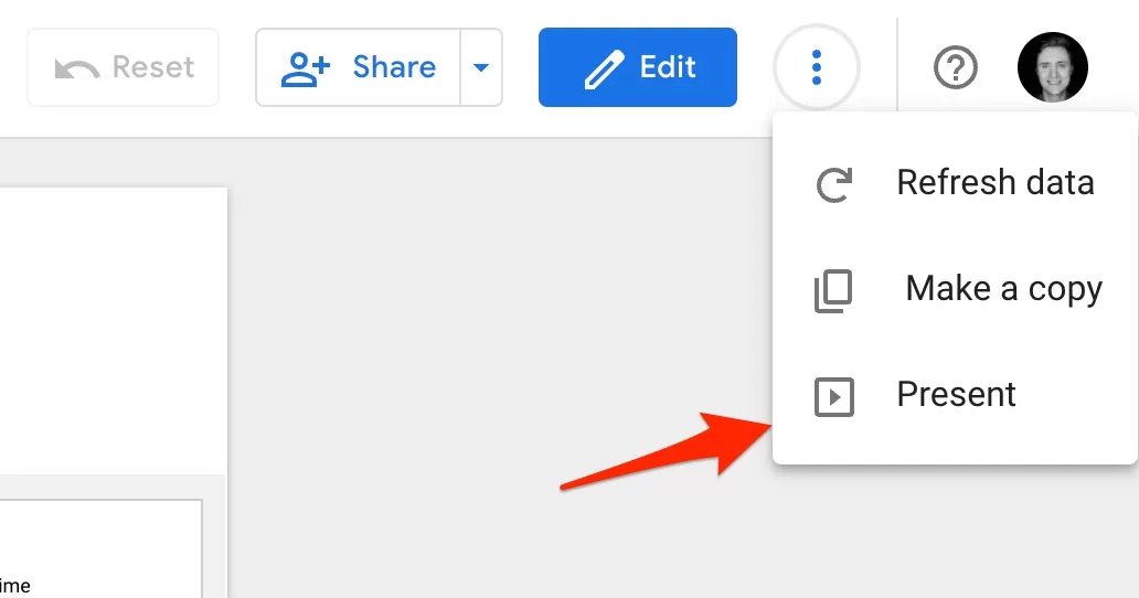
Another cool thing is that you can present that report in a meeting. Just click the 3 dots, here:
I would recommend you play around with templates. Choose any of those and connect your account. Try to edit the graphs, change colors, texts size etc. Just get used to the interface and the options.
Next we will look into creating report from scratch. This is where you can let your hair down.
Starting from scratch
First, you will need to connect a source. This time let’s take my Google Ads account. It’s a small account, so don’t expect to see a lot of data. But this is not important for now.
You can search for a connector or just scroll down to find it.

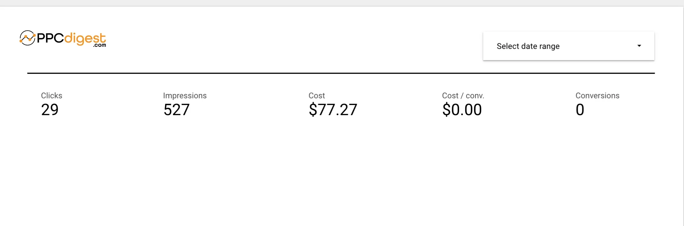
Once done connecting, Google will give you this table by default:
It’s harder to create a report from a blanc sheet as you have to decide first what data you should see. So let’s list things we want to add.
- Spend
- Impressions
- Clicks
- Conversions
- Cost per conversion
- Clicks by Device distribution
- Daily clicks and conversions graph
That’s a high level overview. you can add more, but my advice stick to what tells a story and can yield insights for you or your client.
Then I want to drill down into keywords and how they perform. I think a simple table should do the job.
I also want to add a calendar, so that other can select different periods. And I always like to add comparison to the previous period.
Ok let’s go.
The top overview part. Everything you need to add can be found in the top menu. And all the edits are made in the right menu (remember the templates). Let’s add a logo and a line to make a separation:
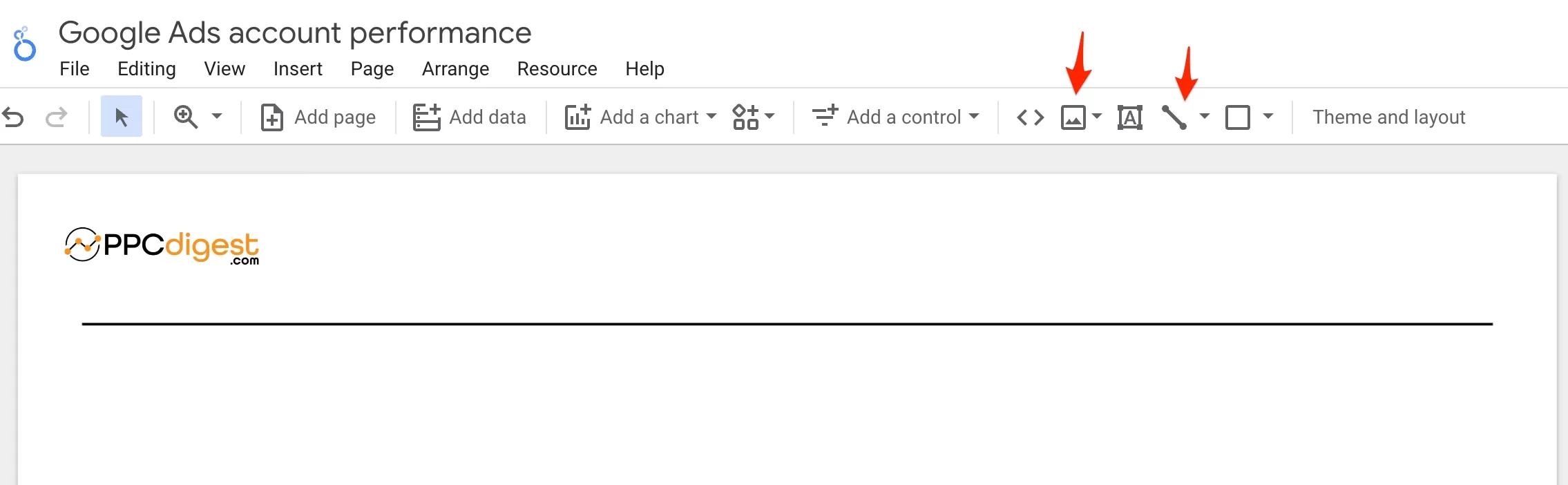
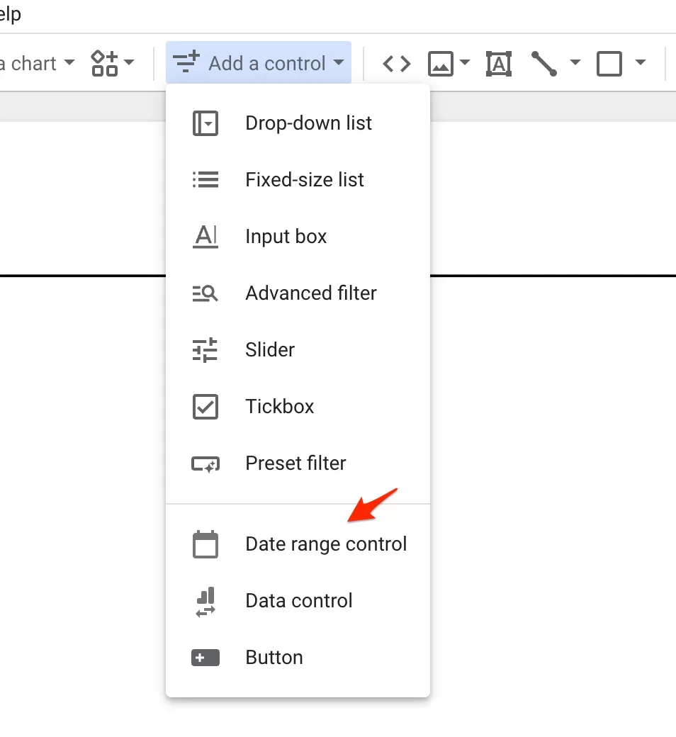
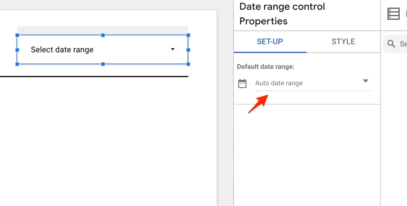
The logo is an image and you can adjust it’s size dragging by the edges. And then you add a line. I will also add a calendar here. Click on Add a control and select Date range control.
Place it where you want. Then select it to change the default range. I like it to be the last 30 days, but for some clients I select Last month. Click on Auto date range.
In the calendar click on the dropdown and select the period you want.

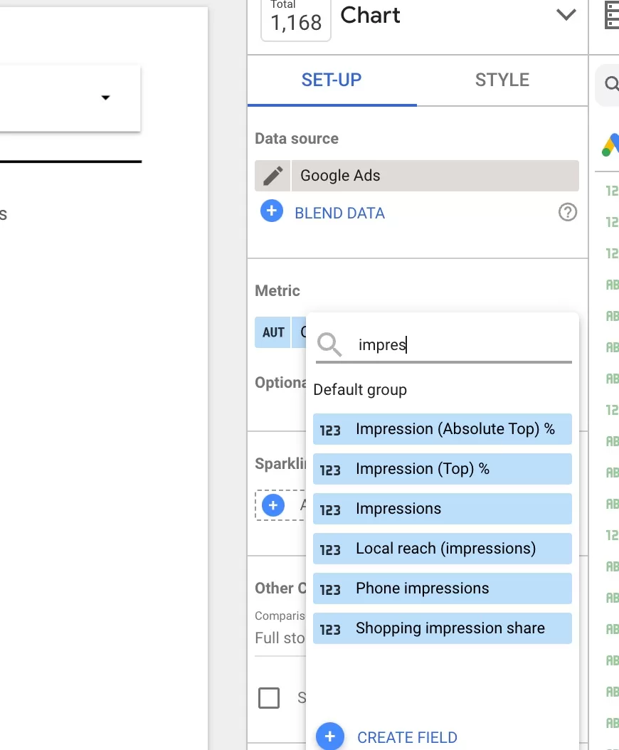
Now let’s add our high level metrics. For that we will use a Score card. Click on add a chart and select Score card.

Place it in the report and if you want to go fast, just copy/paste that score card 5 times for each metric. Now let’s edit each and select the metrics we want. Click on the score card and search for each metric:
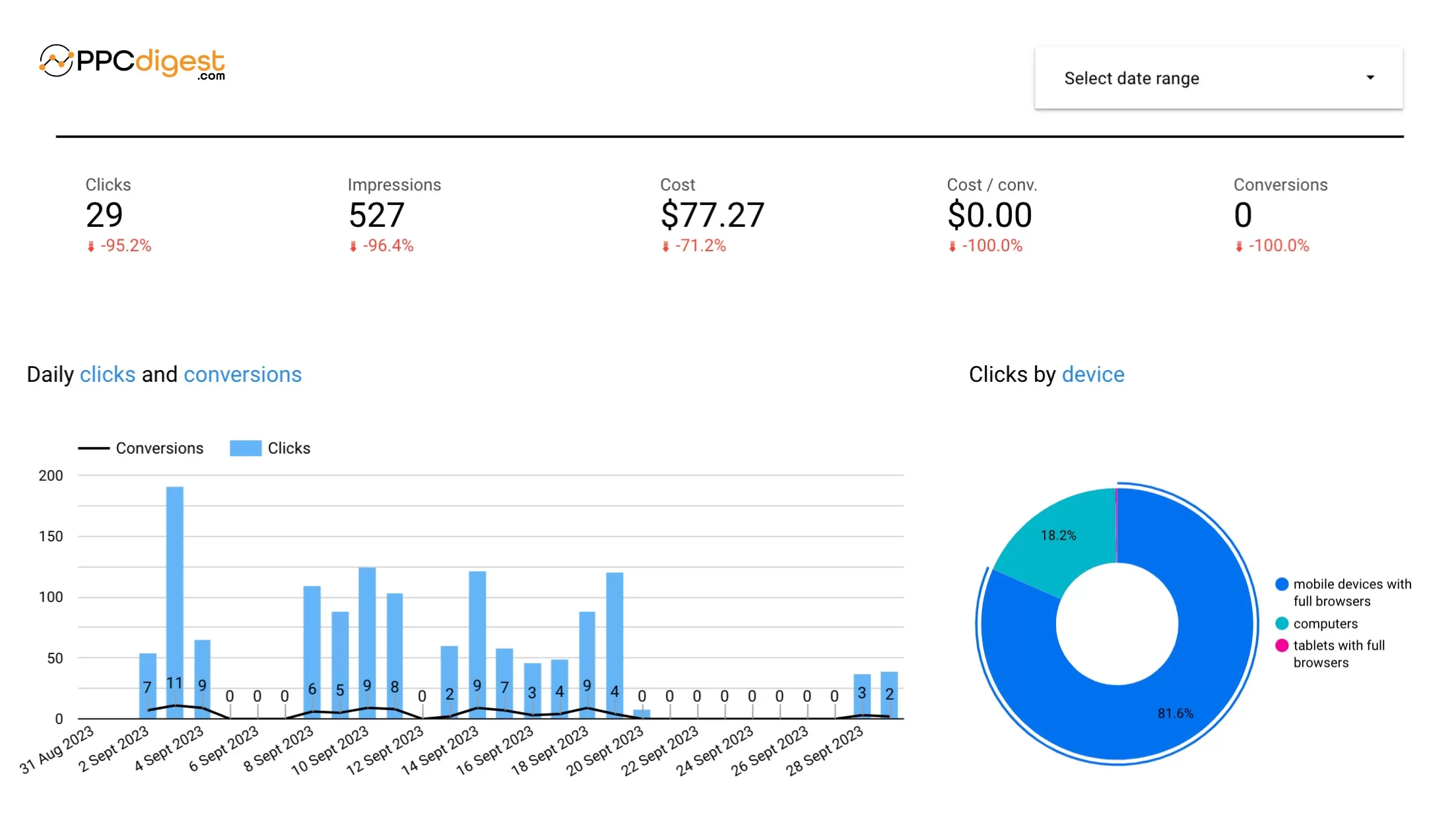
Do this for all score cards. The result should look like this:
As I said I don’t spend a lot on my blog. Just to test things. But you should see your numbers here. We also wanted to add a comparison to a previous period. This is very informative as you can see how your account is doing.
Select a score card and scroll to find date range. Click on none and select the period your you want.
Little tip: you can select all score cards at once, and change it.

Do this for all metrics and this is what you should see:

Nice! Instant insights. You see which metrics dropped which improved and by how much. No more calculations in sheets.
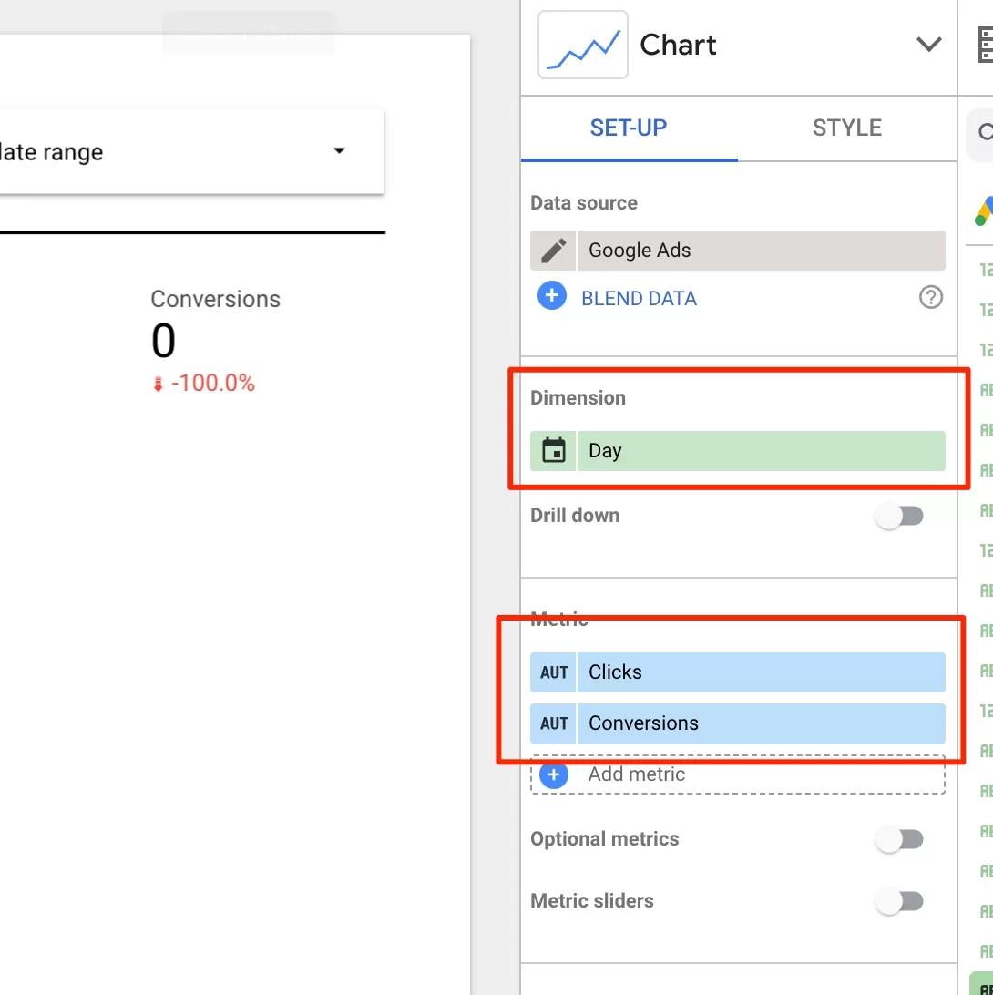
Next, let’s add a graph of monthly clicks and conversions. Click on Add a graph and select bar chart (or line). We need to add dimension, which in this case will be days. And then add two metrics, clicks and conversions.
You can choose to have a line and bars to represent different metrics. They both will show up. Then you can customize the colors and fonts, add graph labels. This is what we have:

You can also add text above the graph to explain what the graph shows. You can find text input in the top menu.
And now let’s add clicks distribution by device. Click again on add to graph and select pie chart. Then go to dimensions and select device. Customize the look how you like.
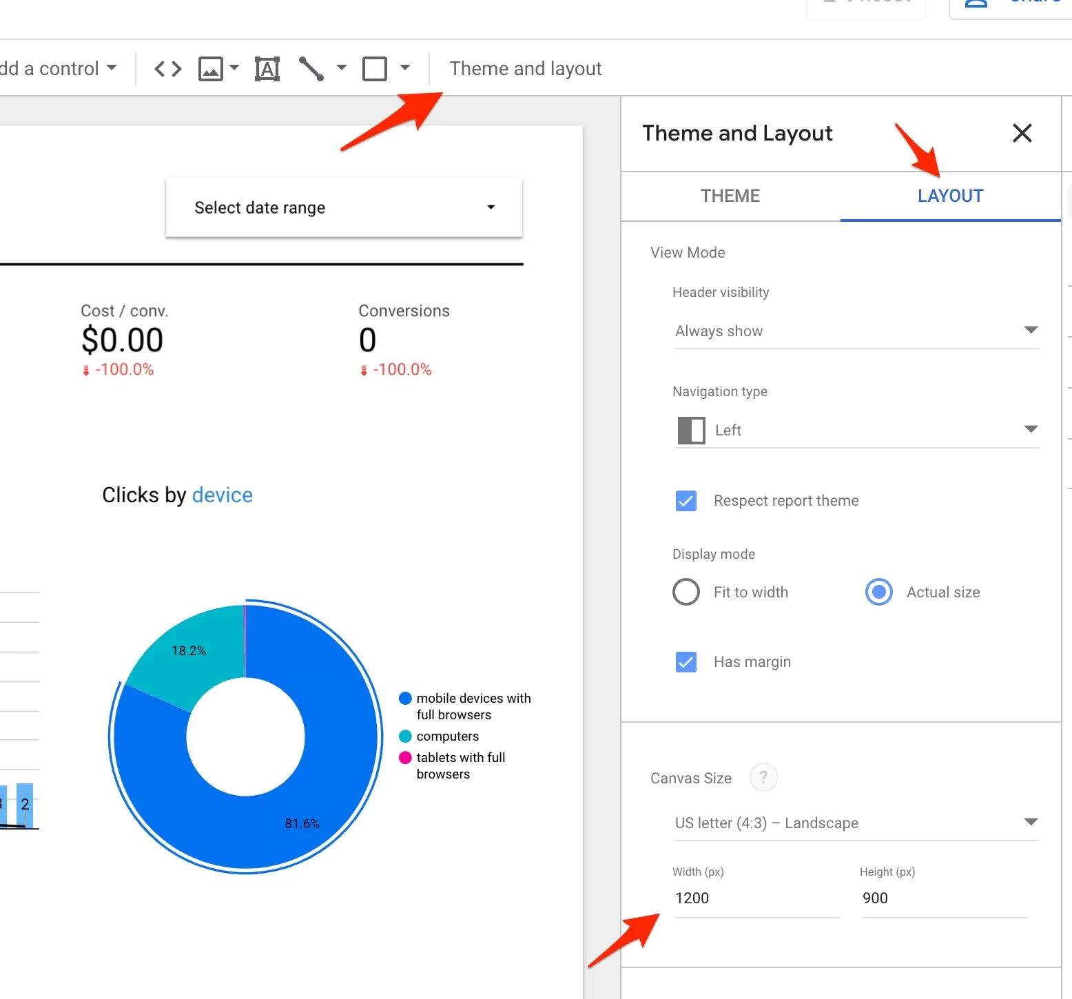
And finally, let’s add a table of keywords, with their individual performance and comparison. But before we do that, you might notice that there is no space bellow. You can change the page size. Click on Themes and layout, then Layout and increase the size:
Now, head over to add to graph and add a table. You will have to change dimension and add as many metrics as you like. Keyword view is very detailed, so maybe break down the table in two? Also, don’t add anything other people (or clients) don’t want to see or don’t have to see.

Keyword view is very detailed, so maybe break down the table in two? Also, don’t add anything other people (or clients) don’t want to see or don’t have to see. I added more metrics along with comparison, so the table became quite “heavy”.
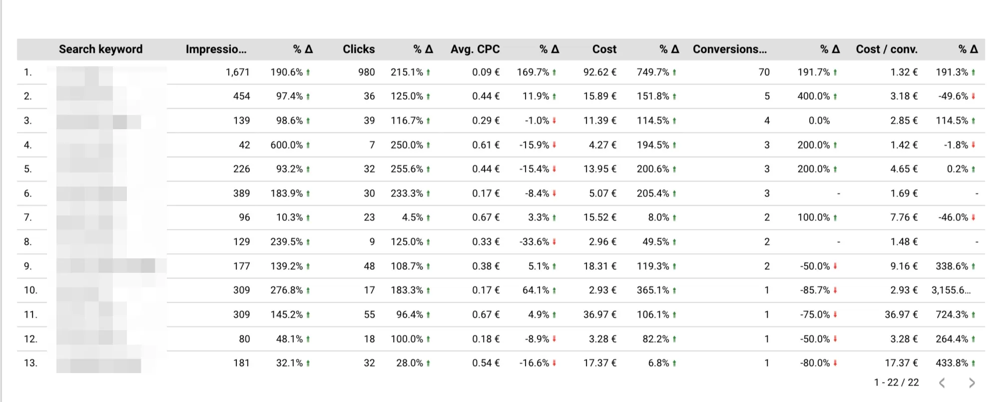
Some people like to get a deeper view, so this is quite informative. You can see each keyword and how it performs compared to previous period.
I will leave the link to this report here so you can check how it actually looks like >> link to the report.
You can add a lot graphs, score cards and tables to the report. But it has a limit. And that limit is 50 charts per page. You can create another page and continue. That can be done the top menu “add page”. When viewing the report users can easily switch between pages.
What I would also recommend is to add text explanations for anyone reading the report. You can place it on the left or right hand side, or just above each report. I do that sometimes, for the clients who are not that savvy. It give that extra touch and they feel pleased.

You know how to add a text, and if you want to add a background, you can find it in the top menu, next to line (remember from before). Once you add a shape you can adjust it and change the color.
Integrating with Other Data Sources
Let’s look at how you can integrate another data source. Usually you want to split reports and keep the focus on a channel, in this instance Google Ads. But sometimes the client wants to add additional information from Facebook Ads, for comaprison. Or additional data from Google Analytics.
Let’s take Google analytics and add additional graphs. Again, list the things you want to add.
- let’s add sources report to see how Google Ads compares to other channels
- and the map to show how diverse the audience is
Ideally you would talk to your client or colleagues to understand what should be in the report. You can have one report that is vey high level (present to managers), and a separate, more detailed report for your team or client who wants to know everything.
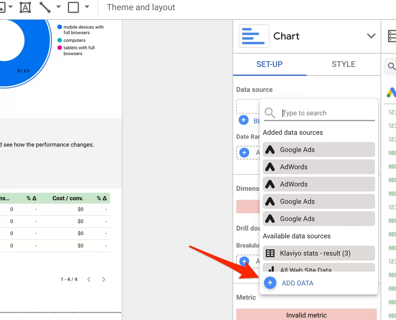
First, you will need to add a new data source. When you add another graph, the source will be your Google Ads account. Remove it and then click on add data. It will bring up connectors and find Google Analytics. Go through the same choosing your GA4 account and property.
Then click to add a chart, I chose bar chart. I always add a separator and a logo with some text to explain where the data is coming from. Remember that with GA4 as a source, the names of the metrics are different. Select sessions as a metric and session source as dimension. This is what you should get:

You make make the chart wider simply by dragging one edge. If you source names don’t fit, hover with the mouse over this line, the mouse pointer should change and you should be able to drag the chart it self, making more space for the text.

And we wanted to add a geo chart, to show the map of where the traffic is coming from. Honestly, it is useless for the data analysis, but it just looks nice and most of the clients love it. I’m adding it here just to show you what can be done.
Click to add a graph select geo chart, and you should see this:

This is where your creative brain can go wild as you can add many sources to compile a comprehensive report. My advice is to always look at the report goals. You don’t want to add to many things as it will beat the purpose of creating a report in the first place. You might as well give access to GA4 or Google Ads.
If you work with clients or you do reports within your company, this should make your life easier. I would assume you might have some sheets or PDFs that you currently use for reporting. You can just transfer everything here and it will keep running automatically.
Pros and cons of Looker Studio
You can’t expect it not to have any cons? It’s a free tool afterwards.
Pros
Unlimited Data
There is no cap on the data. There is a limit of how many charts you can have per page. But not for the data that’s coming in. Some tools have that limit.
Easy access to Google products
It’s a product by Google, so it makes it easier to access other products. It might be harder if you want to add a source from a custom product. It might take time and probably help from developers. But for Google Ads, it’s easy.
Easy to use
As you know by now, it’s easy to use. There is a learning curve, but that is true for most products. Once you know the basics you can create report pretty fast.
Simplicity
It’s like sheets, but simple. There is a lot of drag and drop and you can create nice reports faster than with Google Sheets.
Integrations
As you might have seen, there is a lot of integrations. And this is a lot of value. Sometime you just want the data in one place and through connectors it’s fast and simple.
Customizable dashboards
I showed how you can customize, but I just scratched the surface. If you spend some time you can do magic. I will give some resources later so you can see what people can create.
Free
That’s a big one for me. Usually people who want those reports from me, don’t have a lot of requirements. Which means I save money, by not getting some advanced tool.
Cons
Lack of Real-Time Updates
Even though the data refreshes once you reload the link, or click on the button to get the latest data, with huge data loads it might take a while. I would not recommend it for reporting on huge data sets. I don’t think Looker is designed for that.
No API
Again, this is a con for big companies, where daily reports are needed and you have to use API, to automate many task. It is a con, but not if you’re a small business, or your data demands are modest.
Report Creation Can Take Too Long
We have this saying “The deeper in the woods you go, the more trees there are”. Same with creating reports. Basic takes minutes, but if you try to create and advanced report with filters, and selections etc. it will take longer.
Limited number of charts
I mentioned that earlier. You can have 50 charts per page. Additionally, some charts can be limited in terms how many of them you use.
Editing elements
You will noticed that sometimes editing, changing color, rearranging things have certain glitches. It’s frustrating for sure, but then I remember it’s free.
Slow Speed
It can get slow with lot’s of data. Again, a con for bigger companies. I haven’t had any issues with smaller reports and dashboards. But for the big clients and business, I don’t use Looker or I make sure to create a very specific reports that does not involve a lot of data.
Lack of Support
Well it’s a free product form Google, so support is crap. With Google Ads you might get a reply. With Looker, I don’t even bother.
Conclusion
This is just the basics of what can be done. I strongly encourage you to try it and play around with different chart types, adding more data sources etc. I love this tool because both GA4 and Google Ads reporting sucks. This is something I use to present the data, rarely for analyzing it. But it does give quick insights into trends.
If you have a designer at hand or are yourself a good designer you can customize the colors and the look of those reports. I’ve seen some that look very nice. You wouldn’t even say it was made with a free tool. Check out this link for various templates. Here’s Google template gallery. And another link with free templates. These templates are paid, but they look really nice.
I hope Google will continue to developer Looker Studio and it will remain free. I think it’s a great tool, with lot’s of capabilities.
I share weekly tips on how to create, manage, and scale Google Ads campaigns. Subscribe to my free newsletter.
I’m also down with connecting on LinkedIn.
Or follow me on X, for some quick updates and fast insights.
