

There is a lot we can learn just by observing and studying not only our competitors but also other companies. If you have a chance to work with several different businesses at the same time, great. But most work for one company for a while.
Getting out there to see what and how others are doing stuff improves your learning significantly.
When I write certain posts, I have to google around to see what ads others write. And I always have the same thought: “I should take a bunch of different ads and just break them down.”
So, that’s what I’m going to do today. I’m going to google random phrases and talk about Search Ads that I see.
I will try to look into as many different businesses as possible and just explain why I think the ad is great or what it’s missing. I will also click through to their landing page, because we all know how important is to have the page match the ads promise.
Search ads for “cheap CRM software”
Nutshell.com
This is one of the search ads I got:

- I love how they still manage to meet my expectations by not using the word “cheap” and replacing it with “affordably priced”. Many companies try to avoid the word “cheap” in their ads because it is associated with poor quality.
- I also like that they used a price to show that it’s quite affordable. Although, this might not be that useful if this is my first search and I don’t know what the usual prices are.
- Mentioning a free trial and the fact that no credit card is required is also a great boost.
- The headline “Just sell, we’ll do the rest” focuses on the benefit, not a feature, I love that as well.
- The same goes for the description, “Turn more of your leads into wins”.
When we click through to the landing page, I’m slightly disappointed. I’m going to screenshot only what I see on my laptop. Above the fold matters a lot, and people might not scroll down if you fail here.

- Not a fan of this title. I would expect it to continue with that “affordability” angle.
- They show the trial, but I don’t see that a credit card is not required. I would put that here as well.
- Personally, when I see “Contact sales,” it means it’s going to cost me. I would either remove the button from here since we have another one in the top corner. Or have a different CTA, for example, “Asks as a question”, “Schedule a call/demo”, or just simple “Contact us”
- The video is great, and having a CEO there feels more personal. It has this small company vibe that corresponds with affordability.
- There are 6 bullet points, and I would recommend to have around 3. Research shows that having many bullet points (4+) overwhelms the user. They can’t remember all of them anyway. And just by reading them, I see that some of them are more of a key benefit, and the other are more of a nice to have, like “customize your dashboard”. It’s something many CRMs would probably have. Not sure if it’s a strong selling point. Besides, there is a video where you can explain (show) this in more detail.
Monday.com
Here’s a search ad for Monday.com, the same search query.

- This is another way you can get a way of not using “cheap”. I would assume that Monday.com categorizes similar queries as coming from small to medium companies that are very conscious about their spending. This is a smart move. If you’re a big corporation, you would not search anything with the word “cheap”. This shows you how important is to analyze keywords and create a good campaign structure.
- They also use a benefit in the headline “without frustration”. CRMs tend to be bulky and complicated.
- I think they need to update the year in the description. Unless it is some kind of a reward for 2023. But honestly, the whole line sounds a bit heavy “Best Code-free CRM SMBs 2023”. Not sure if having 2 abbreviations in one short sentence is great. Makes it hard to understand. Why not just have “Best code-free CRM of 2023”.
- They display the number of customers, which is always a great boost.
On to a landing page:
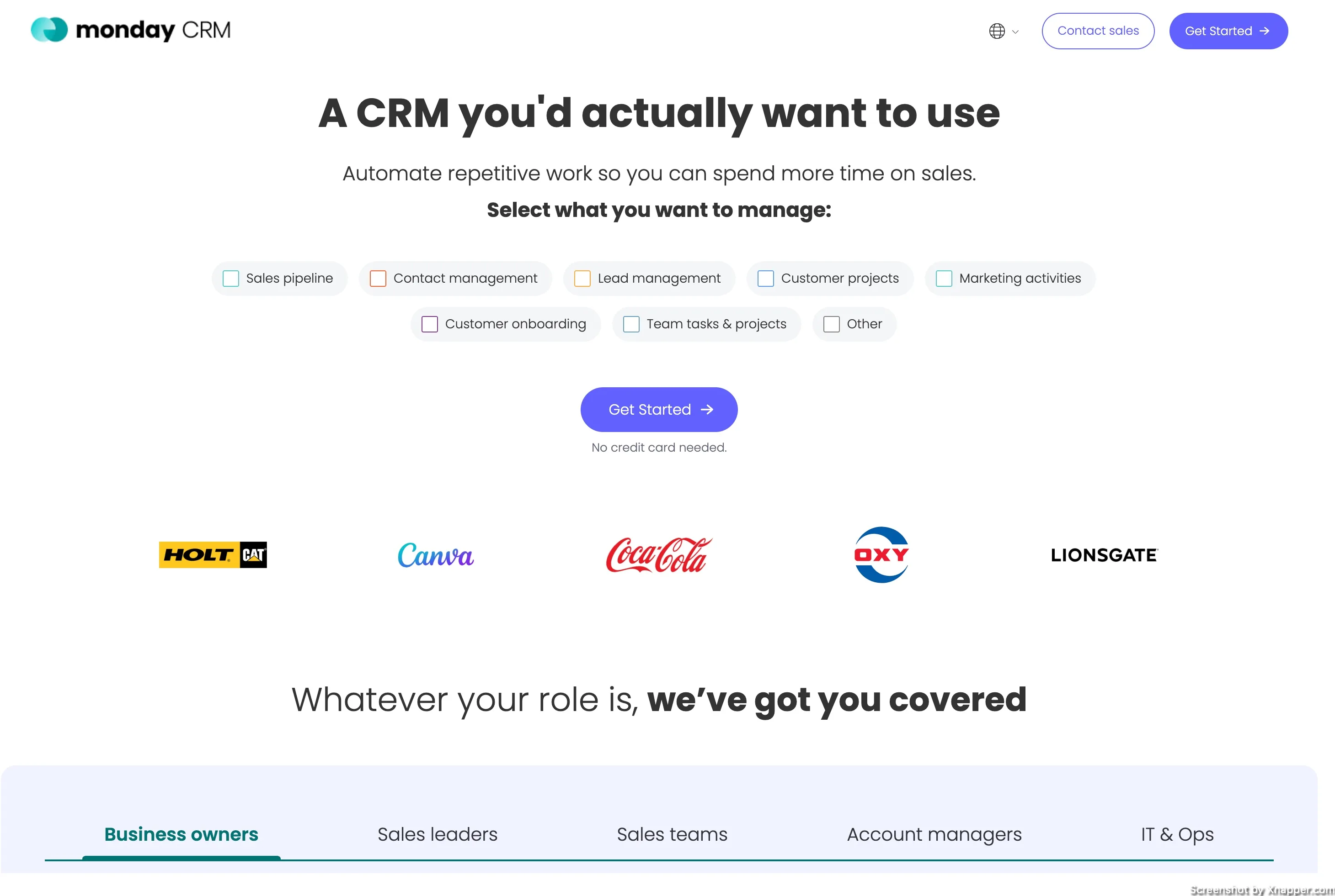
- I see that they have dedicated landing pages for ads. Not sure how many, but having separate landing pages is really good.
- Unfortunately, this landing page does not have a headline that would work better with the ad. Ideally, it should mention Small-Medium businesses. For example “A CRM design for Small to Medium businesses you’ll actually use”. I’m sure they can come up with a better one. If the ad was focused on smaller companies, their landing page should also reflect that.
- I love simple CTA and the no credit card requirement.
- I’m intrigued by how selecting what you want to manage impacts conversions. On the one hand, users see what they can actually do, and this increases the chance of them selecting the answer (task). It caters to the user better as they believe they are personalizing the CRM. This, in theory, leads to better conversions. On the other hand, additional action is required, and the user is forced to stop and think about what he wants to do. Additional cognitive load oftentimes reduces the conversion rate. I’m curious if they tested it and how it performed.
Search ads for “best AI video editor”
Colossyan.com
This is the first search ad.

- Having “#1” is a great way to meet my query, as I wanted the best editor. At the same time, the hashtag and number make the ad stand out.
- Trial and no credit card, great.
- Benefit-driven description “create videos in mins, with just your laptop”
- I like how they added the whole review into the description.
- Notice how the site link assets have benefits and features. You have unlimited minutes but also AI avatars. Cool.
Now, the landing page.
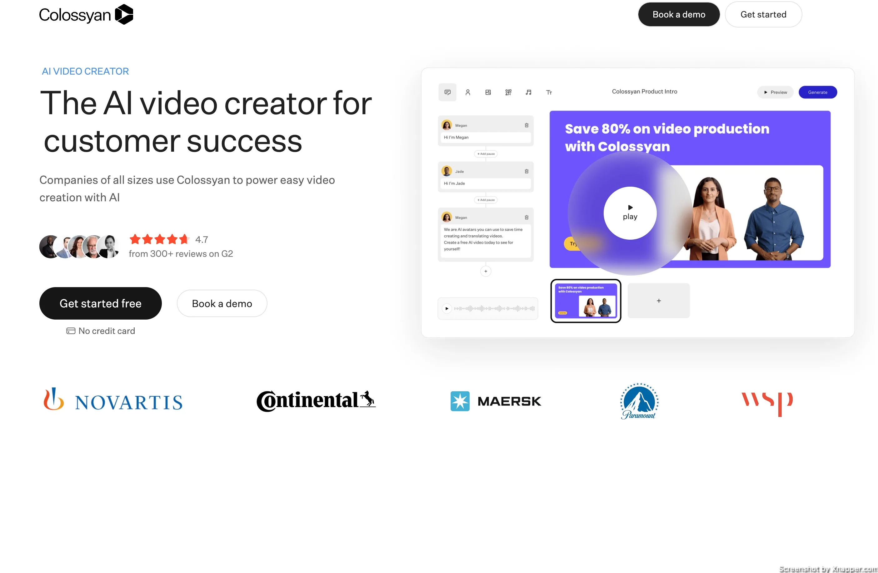
- Well, that is very bad, as the title has nothing to do with the video editing. The title just says Ai video creator for customer success. Not only that the last phrase changes to say for sales training.
- It is weird why they would create an ad that talks about video editing when their business is about creating videos. And for very specific cases.
- Apart from that, the landing page is nice. You see the reviews and ratings, a clear CTA, and a video to see the product in action.
- Notice how “book a demo” is smaller and white. It’s a secondary CTA and should not overshadow the main one.
Goldcast.com
Next ad for the same query.

- Simple, yet effective. A free trial is always nice.
- They do repeat AI video editing twice, but I think it’s just this combination. I’m sure they have more headlines.
- I like that they have platform-ready formatting. I assume it is when you want to edit the video for Instagram. It’s easy. I would recommend actually mentioning the platforms, something like “TikTok ready formatting”. I think this might speak more to the audience.
- I feel that the ad is more feature-driven. I would change it up a bit to make it benefit-driven, like “generate clips in minutes”, “One click transcriptions”.
Landing page:
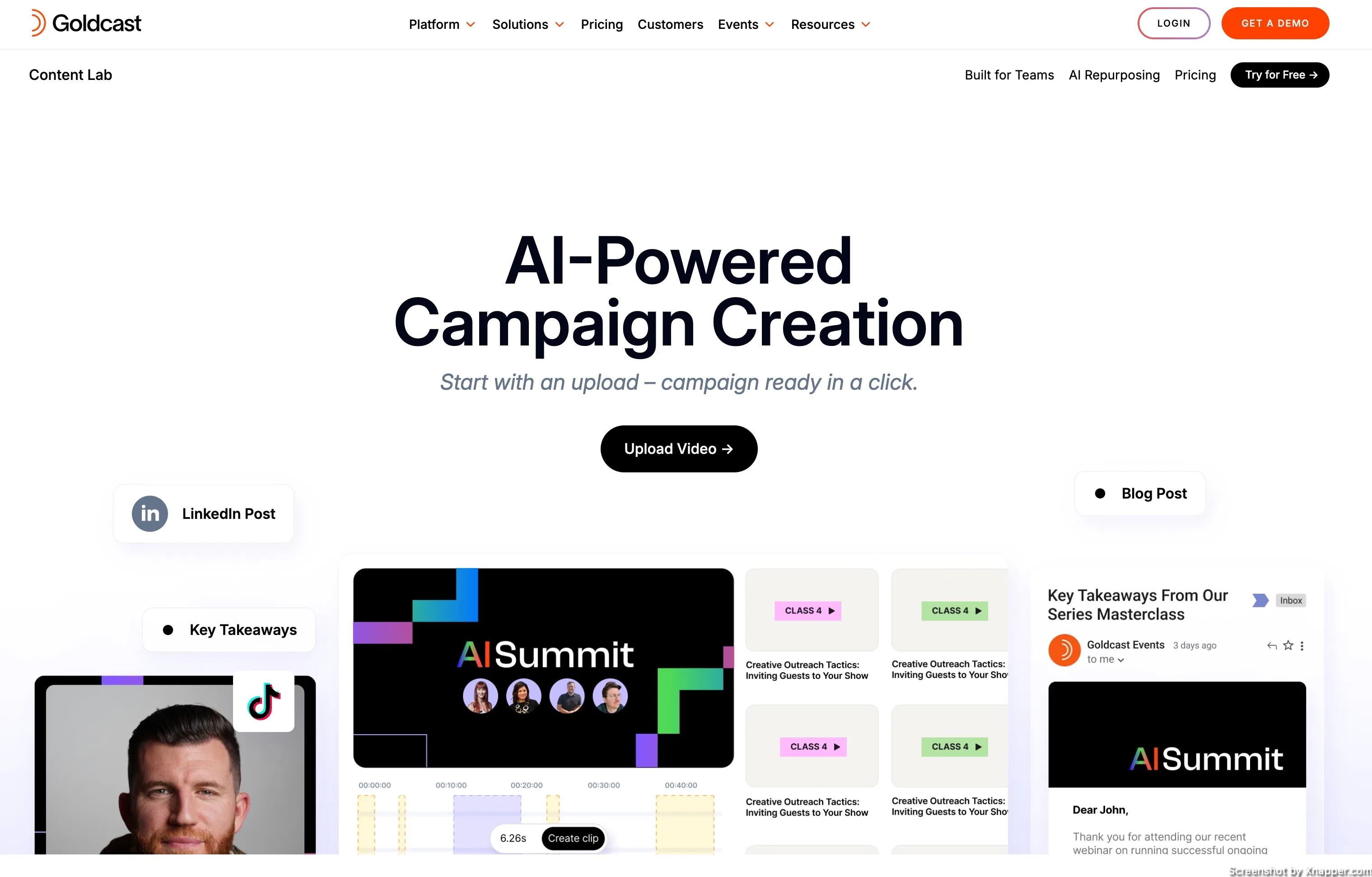
- Again, the headline does not deliver. Suddenly, it’s an AI-powered campaign creation. Can I just edit videos or not?
- The subtitle is great, “campaign ready in a click”, but it’s not what I want.
- I like the custom CTA “upload video”. If you can use something like this instead of “start now” or “sign up”. CTA start with something I want to do and I would need to do if I want to edit the video.
- It’s great that they mentioned LinkedIn and blog posts, but I would, again, focus on different platforms and showcase that at least with the video editing software. This may not be it. I’m confused.
- I think what they show here is their features, but it is very hard to understand it. Take the one on the right. It looks like a placeholder, but when you hover the mouse over it, it says, “Create email summaries from recordings”. So, do they show the result of that feature? It’s confusing; I think a simple feature and benefit layout without clear headings and bullet points would have been enough. Sometimes, you don’t need to reinvent the wheel.
Veed.io
Last from this search query.
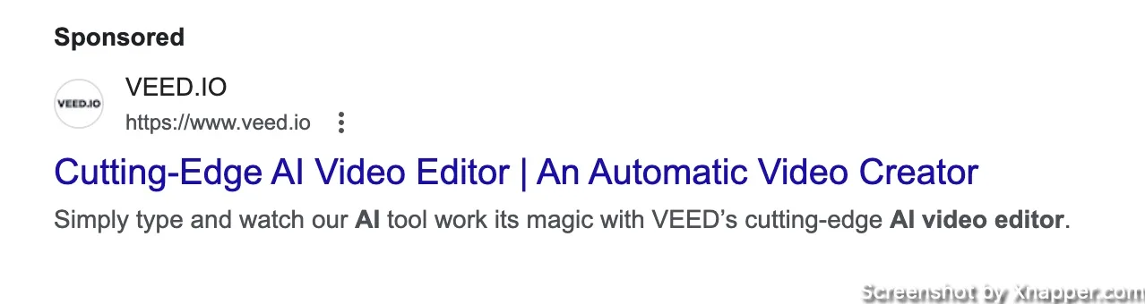
- They do love the phrase “cutting-edge”. They use it twice. Honestly, this means nothing. AI is already a cutting-edge thing. It’s like saying buttery butter. Tell me why it’s cutting-edge. Don’t use words that just sound cool and can be applied basically to any product. “Cutting-edge tires”, “Cutting-edge speakers”. And? What’s so cutting-edge about it?
- I see they have several headlines for different phrases, you see video edit, then video creator. It’s good to have more as people might want to edit and maybe create or vice versa. But in my case, I want to edit, and they deliver it.
I really was hoping for some cutting-edge landing page, but:
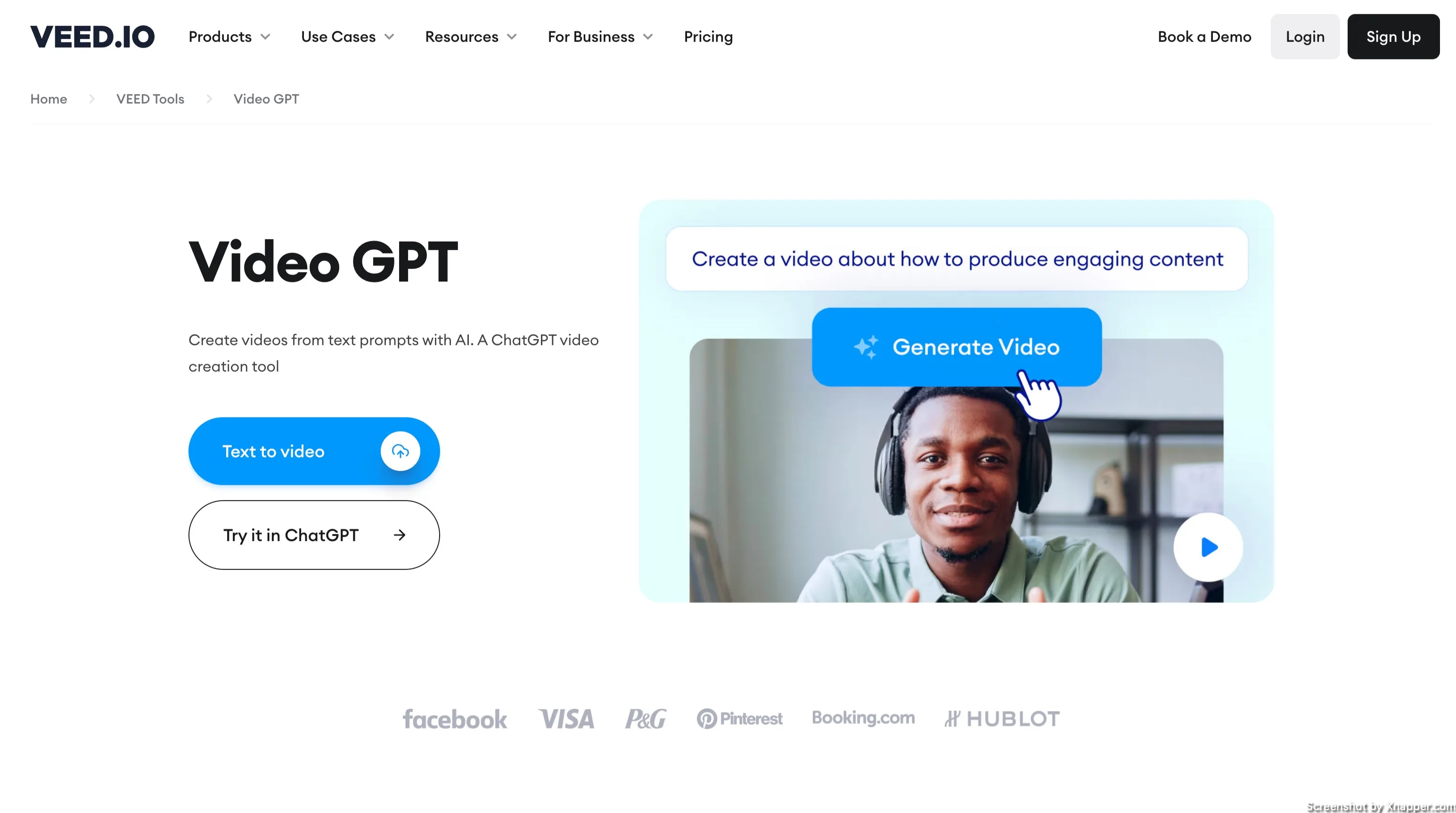
- It’s great that they simplify things and piggyback on chatGPT to explain what it is. It’s a good tactic. Probably more people are familiar with how chatGPT words and not how Veed.io works.
- No mention of video editing. Focused more on creating videos, I suppose. So missed that mark. Not sure I would even proved further.
- They have a chatGPT app, that’s why there us a secondary CTA. I hope there is a reason for that because I would want my users to stay on my website.
- The main CTA is text-to-video, and there is an upload icon. But when you click on it, it just goes to the input field, where I have to type the text. It’s confusing.
Search ads for “digital marketing agency”
Roasppc.com
Let’s see how digital marketing agencies do their Search ads.

- I like the name. PPC ROAS would probably make more sense, but maybe that one was taken.
- I see that they are trying to separate themselves from the pack with an “anti-agency” narrative. I think it’s interesting. Everyone needs an antagonist.
- The continuation with “us vs. them” and the deck comparison is a nice touch. However, do most agencies really have 100-page decks? And for me, sometimes a 10-page deck can be boring as hell. Also, I think it’s not about the deck length but about the value the client gets. It seems that their value is in making shorter decks?
- I think they looked at the ad more creatively, and sometimes it works. However since digital marketing can be a broad set of services, maybe mentioning your core services would be nice. They may have done it in other headlines.
- Also, they mention their own name in the ad, which is not necessary, as people might not know you. I would rather write “Great ROAS on your PPC”. If they want to be creative, they might say, “Others talk, we deliver.”
It gets quite interesting on the landing page:

- It looks like the person writing the ad wasn’t allowed to pitch in when choosing/creating this landing page, which is actually their home page. Do you feel a totally different vibe?
- I may not be a native English speaker, but do people say, “Get a free consult”?
- Remember, I came looking for digital marketing services, and the ad promises action and ROAS. It had this “we are performance marketing all about action” vibe. But the title is more of a PR/branding campaigns vibe, no? Also, the subtitle is more confusing. What is “investment into growth assets”?
- Stock images are fine; not all people can afford to take their own images. But, I mean, just a picture of tall buildings? Unless this is their office.
- This ad was in the first position (when I googled) in the US, well, the NY area, but still. I would be surprised if this page converts well. And they are all about ROAS PPC.
Designzillas.com
Next ad for the same query.

- They mention a few of their services: content marketing, SEO, and conversion rate optimization.
- Award-winning is great, and I hope they have proof on the landing page
- Again, they mention their name, “Zilla digital agency.” Unless you’re a known agency, mentioning your name does nothing. Well, a small ego boost, I guess.
- More services in the site links, great.
- I like the case studies site link. I think every agency should have something similar that shows not only the client logos but some nice case studies.
- Love the picture. Just a simple picture of the whole team, taken with an iPhone (assuming) no effects, no professional photographs, no stock images.
- I don’t see any call to action. I think none of the ads had a clear call to action, at least in the headline. Which is a shame. It’s a great way to nudge people and increase CTR.
Let’s see what kind of reward they won.

- Ah better. Don’t you feel like, the first agency should have had this landing page?
- Title: big, powerful, straight to the point.
- A little social proof that’s nice. But the way they designed it, I initially thought it was the companies they work with. I would probably change that, adding the actual reviews here instead of a number. I would talk to clients and ask them permission to use a picture, title, and review. Way more powerful.
- This is a dedicated landing page for Search campaigns, which again is a big plus.
- The form is OK. It’s good that they show the steps. I know what happens next. I would add how long it takes to receive a proposal.
- I would use fewer fields in the form, as there will be a call where the agency can find out more. On the other hand, adding more fields can be used to filter out people, that too lazy to fill in, meaning not serious about become their clients.
- They did have awards listed on the landing page, but I had to scroll down. It turns out they have quite a few. I wonder if leading with that would be better. But maybe they tested it.
Smartsites.com
The last one is for the same query.
- It’s a bit similar to the first agency, with its “agency’s rival #1”. But it puts a different spin on the ad, and sometimes it works great.
- I like the statement “proven results”. They still would have to prove it to me, but it gets my attention.
- Love the benefits in the description.
- And they have a very clear CTA, but it’s in the description.
- Not sure if I like the picture. It’s sort of behind the scenes thing. But are these guys the founders? Maybe clients? What is happening? If those guys are the founders, I would put them smiling up close. Smile and eye contact work great. It feels more personal, and the smile evokes positive emotion towards the company.
And on to the landing page.
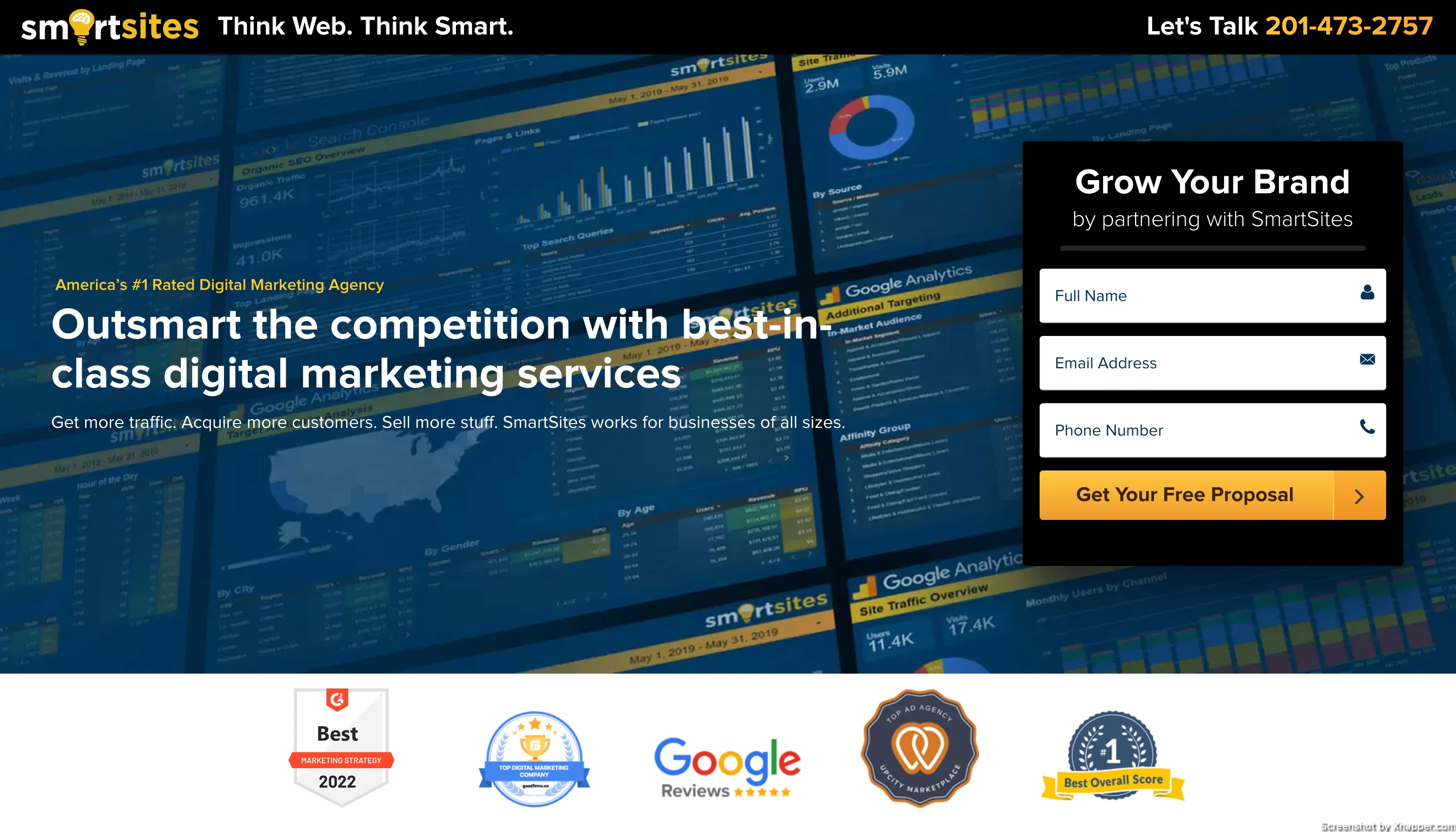
- I have to admit, I hate heavy backgrounds like this. It’s harder to read the text and your attention jumps back and forth between the background and the title, along with the form. Why the distraction? It’s unclear what’s in the background anyway, a bunch of random graphs. They may be real, but in this case, I would use them later on, such as a case study or a proven result.
- Notice the yellow text above the headline, #1 rated agency in the US. That’s a bold statement. They do have these logos to prove it. The reviews seem to be legit. Obviously, they may not be the best every year. I’m not sure how that voting takes place on those websites, but I’m sure not the whole US voted. But great use to boost conversion rates.
- See how the form differs from the previous agency. Only 3 fields are needed, and you get a free proposal. I like the small subtitle in the form. Clever.
Search ads for “payroll services for small business”
Justworks.com

- The headlines are spot on. They match my query.
- I also like the description. It focuses on the benefit of removing the headache of payroll.
- Simple and effective.
- They are missing an image asset. Maybe Google decided not to show it, there are some requirements for it.
- [After I saw the landing page]. They have bunch or rewards, I would include that in the ad.
- [After I saw the landing page]. They claim you can start paying your employees within 2 business days. That sounds fast. They should put it in the ad as well.
Let’s look at the landing page.

- I like how they continue the small business angle from the ad. This is what I wanted from my query.
- The subtitle may be a bit too long, but it’s great that it repeats the “focus on your business, not payroll” theme.
- Notice that the form button is greyed out. Don’t do this. I assume it will become active once you fill in the form. But CTA has to be visible at all times. People have to know what to do next.
- I’m not a fan of the question “how did you hear about us?” is mandatory.
- It’s unclear if this is a lead form, meaning someone will contact me or I will create my account. If it’s a lead form, I would test fewer fields. If it’s an account creation, I would change the CTA to “Create free account.” People need to know what will happen after they fill out the form.
- I would think about a short video showcasing how the product looks/works. If it’s a truly simple solution that just works, they need to show it.
Gusto.com
Another ad for the same search.

- Just like before, they addressed the small business in the ad.
- They also mention that in the description.
- Payroll in minutes, which is a very good value proposition. I can’t verify that, but at least it sounds great in the headline.
- Good job at mentioning the 300,000 businesses they work with.
- Notice the “simple”, “a breeze”, “in minutes”. I think it’s a good message to convey. Payroll can be complicated, so it’s a great angle.
- Also missing an image asset
Landing page:
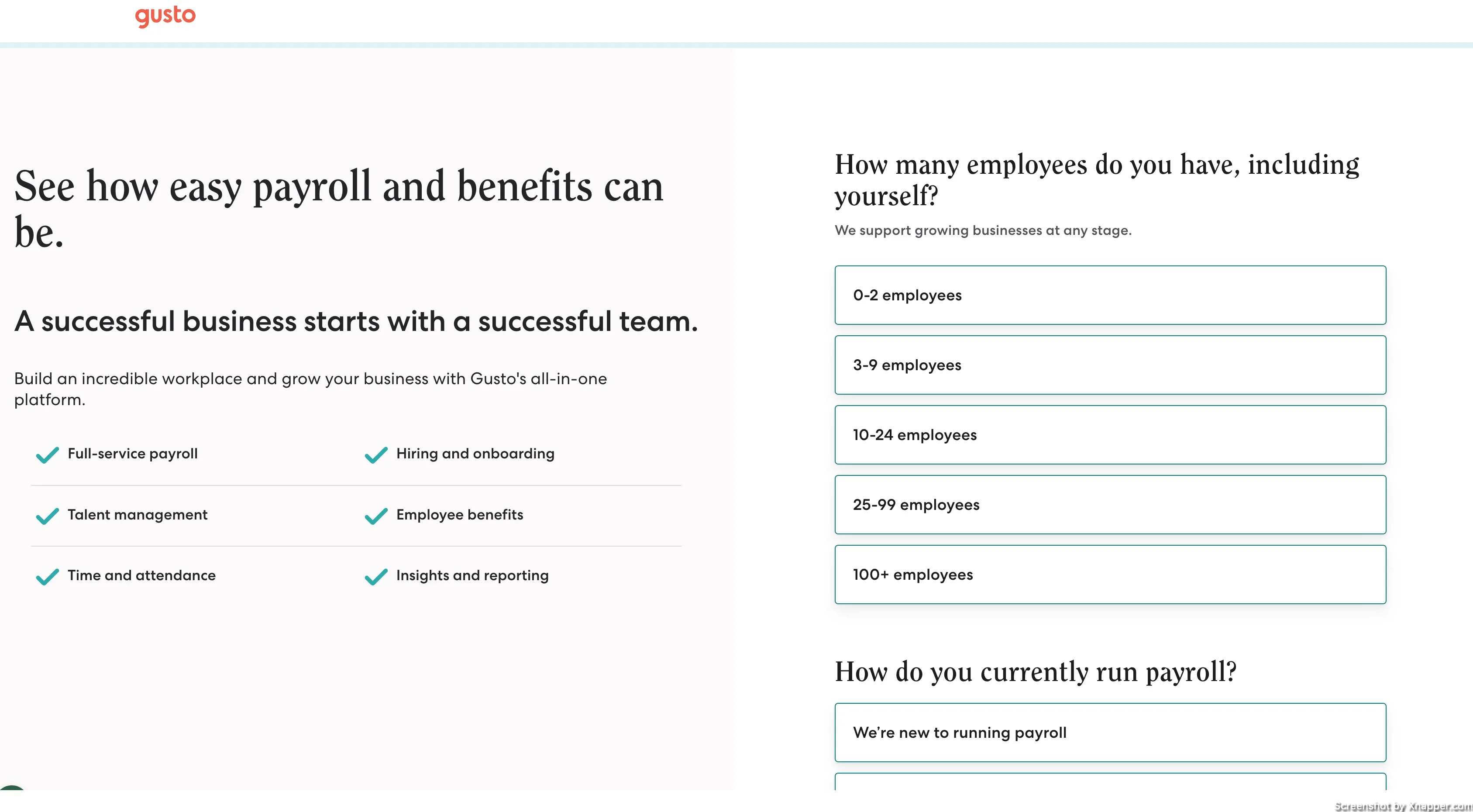
- What is that font for the headlines? Just use the same as for the rest of the text. Makes it hard to read.
- They have a separate landing page for ads, which is great. I would assume they test them, as this one is a survey-based landing page. Sometimes, they increase conversion rates because people feel more committed once they start answering the questions.
- I think it’s a bit text-heavy. Since they have a survey on the right, I would probably reduce the amount of text on the left
- 6 bullet points, we talked about this. Go with 3-4 max.
- I think this sentence, “A successful business starts with a successful team,” is more of a tagline. I don’t think it is needed here. It also sounds like it can be used for HR company.
- They have a button with the name “Submit”. No one likes to submit. Avoid it. Since there is a second step (I’ve tested), it would be better to write “Continue”.
Remote.com
And the last ad.

- This ad missed the mark on the “small business” part of the query.
- I think it could be an old Search ad. I see two headlines and a description. Quite similar to expanded search ads.
- The description is very corporate’ish, “…power your international expansion”. Definitelly doesn’t have the small business vibe and probably is after big corporations.
- They have sitelinks, but no image assets. In general, not a lot to say about it. Seems like a neglected ad.
Let’s see if they are really that corporate.

- OK the landing page looks better than the ad. They do have a separate landing page for ads.
- Nothing about “small business”, so I guess they are more focused on international companies.
- Awards are there, great.
- There is a lot happening on the page. Let’s count: book a demo form; live chat; Register for webinar. What should I do? If you have several actions, prioritize them. Make the main one stand out.
- Also, notice the text in the chat: “We’re glad we came up in your browsing.” Well, it was the ad. I wasn’t browsing on Google, I was searching. What’s wrong with just “Hey, I hope you’re having a great day, let us know if you need help”.
- 3 bullet points, great! But they kinda get lost in the background and other elements around them.
I share weekly tips on how to create, manage, and scale Google Ads campaigns. Subscribe to my free newsletter.
I’m also down with connecting on LinkedIn.
Or follow me on X, for some quick updates and fast insights.
