
Landing pages are an essential part of Google Ads campaigns but are often overlooked. Each of your ads must have a link. You have to direct users somewhere after the click. And the page you choose is your landing page.
But why should you care about landing pages when running Google ads campaigns?
Google ads is just a tool to get traffic to your website. Period. What kind of traffic you get is up to you. But once the ad is clicked and the user is on your website, that’s it. The Google ads part is done. Your landing page or website takes over and has to guide the user until the end – a conversion.
And this goes for all advertising platforms. They are not magic platforms. You can target various users, get them to see your ad, and even click on it. You can have the best ads, and the biggest budgets, but if your page sucks, you will fail with your marketing campaigns. And this is not Google Ads’ fault. You will have to fix your landing page.
And this is why it’s so important to understand what is a good landing page, and how to create one for your Google Ads campaigns.
What is a landing page?
As I mentioned above landing page is just a simple page where you direct your traffic from marketing campaigns. It doesn’t have to be just Google Ads. Any marketing campaign from Facebook, email, TikTok, must have a page where users go after clicking. That page is your landing page.
In general, any page can be a landing page. Even home page, although not recommended. There are a few exceptions when you can use your home page as a landing page but I will come back to that later in the post.
But any page is not a good landing page. Usually, landing pages are created for a specific purpose, like your Google Ads campaign. In fact, there are usually several if not dozens of landing pages depending on your audience, product, marketing goal etc.
That’s why landing pages play a crucial role in digital marketing, as they are optimized for a specific purpose. Better than our regular web pages.
Let’s look at one landing page. I googled “living room couch” and this is the ad I got:
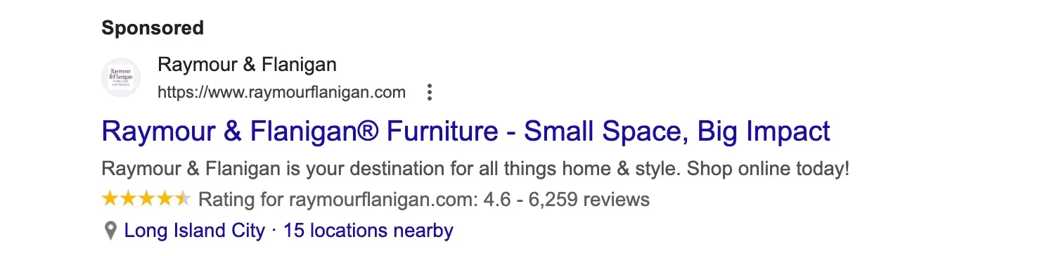
Honestly, it’s not a good ad, but let’s ignore it and click. This is the landing page that I get:
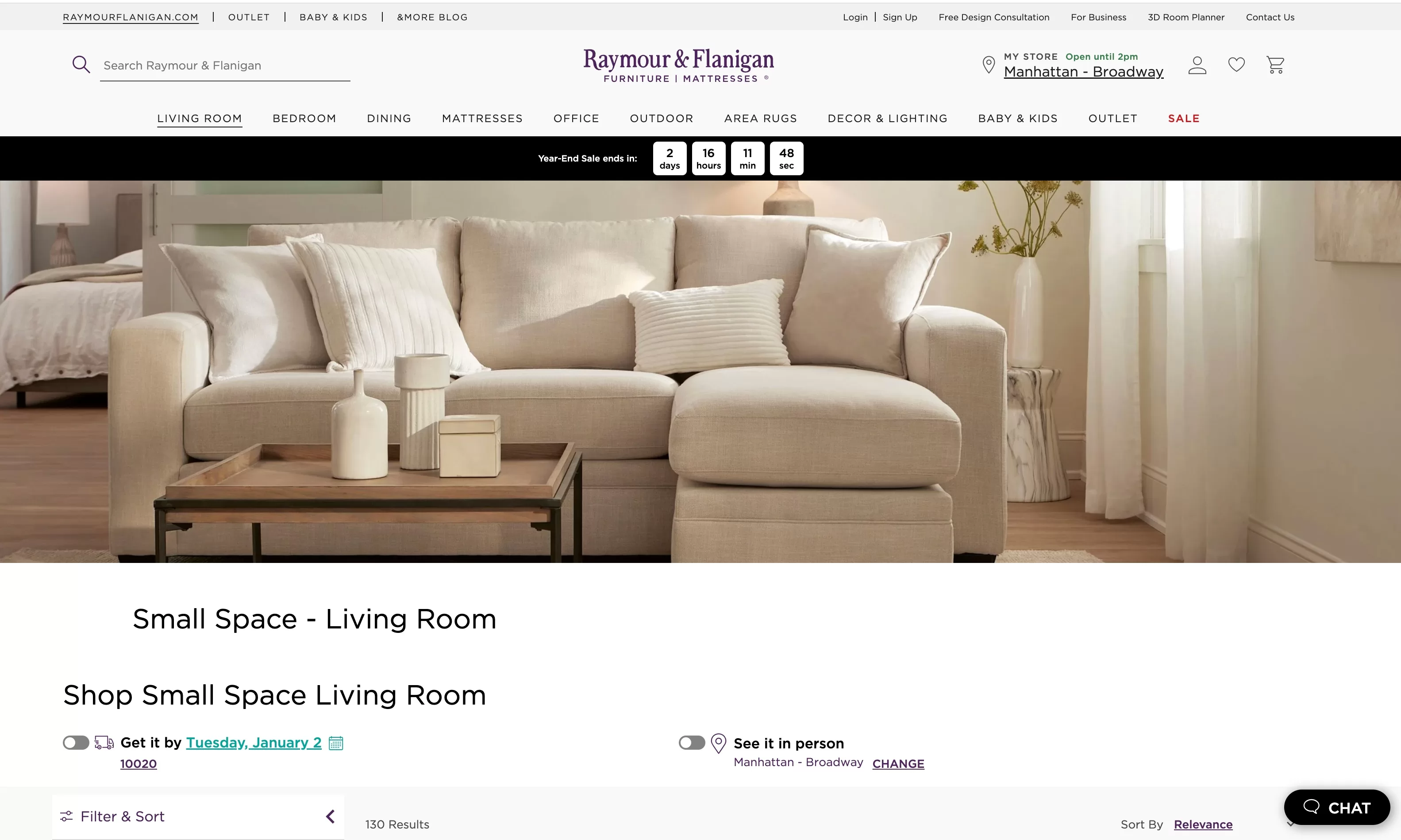
There are several things wrong with this landing page, but I will discuss them later in the post. But would you say you’ve ended up where you expected when clicking the ad? Some of you might say “yes” since you see a big picture of the couch. You also have two headlines. For some reason, they say the same thing, but they are about living room furniture. All in all, it’s not too bad.
Below the picture, there was a list of couches to buy.
This is basically a website category where the business decides to land users after they click the ad. Even though it’s just a regular page, in this instance, it also serves as a landing page.
I assume you wouldn’t be happy if you landed on the home page, right?
That’s why you need to create(pick) landing pages for each of your ads. And I would say the key benefits of a landing page are:
Conversion Focus. Unlike general web pages, landing pages are specifically designed with a single call to action (CTA) in mind. This focus helps to guide users towards a specific action, such as signing up for a newsletter, downloading a whitepaper, making a purchase, or registering for a webinar.
Targeted Messaging. Landing pages allow you to craft targeted messages for specific audiences or marketing campaigns. This relevance can significantly increase the likelihood of converting traffic into leads or sales.
Testing and Optimization. This is my favorite. You can’t always test and optimize your general pages, but with landing pages, it’s a totally different story. Landing pages are ideal for A/B testing different elements such as headlines, images, copy, and CTA buttons. This way, you can test your way to a better-performing landing page.
Ad Campaign Relevance. This is similar to the targeted messaging I mentioned above, but I wanted to mention this in the context of ads. You can tailor landing pages to specific campaigns (images, texts, CTAs), especially for Google Ads, where your landing page is also taken into consideration when determining the Quality Score.
Fast to produce. Landing pages can be created relatively quickly. Besides, there are plenty of SaaS businesses where you can easily create your landing page. I will expand on this later.
Since we know how important landing pages are, let’s dig in a bit deeper.
Key elements of an effective landing page?
Landing pages can be very different, created for various products or services. There is no one golden rule what should be included in the landing page. But there are elements that help make it a lot more effective.
When reading, try to imagine your product or service, and you will notice that some things can be applied, and others just won’t make a lot of sense for your offering.
Clear and compelling headline
Headlines are the first thing users read when they land on a page. If your headline is too vague or not compelling enough, people might just leave the site. You can’t afford that since you just paid a few dollars for a click.
This is not the place to be creative. Just tell people what you have or confirm that they landed in the right place.
Take a look at these two landing pages:
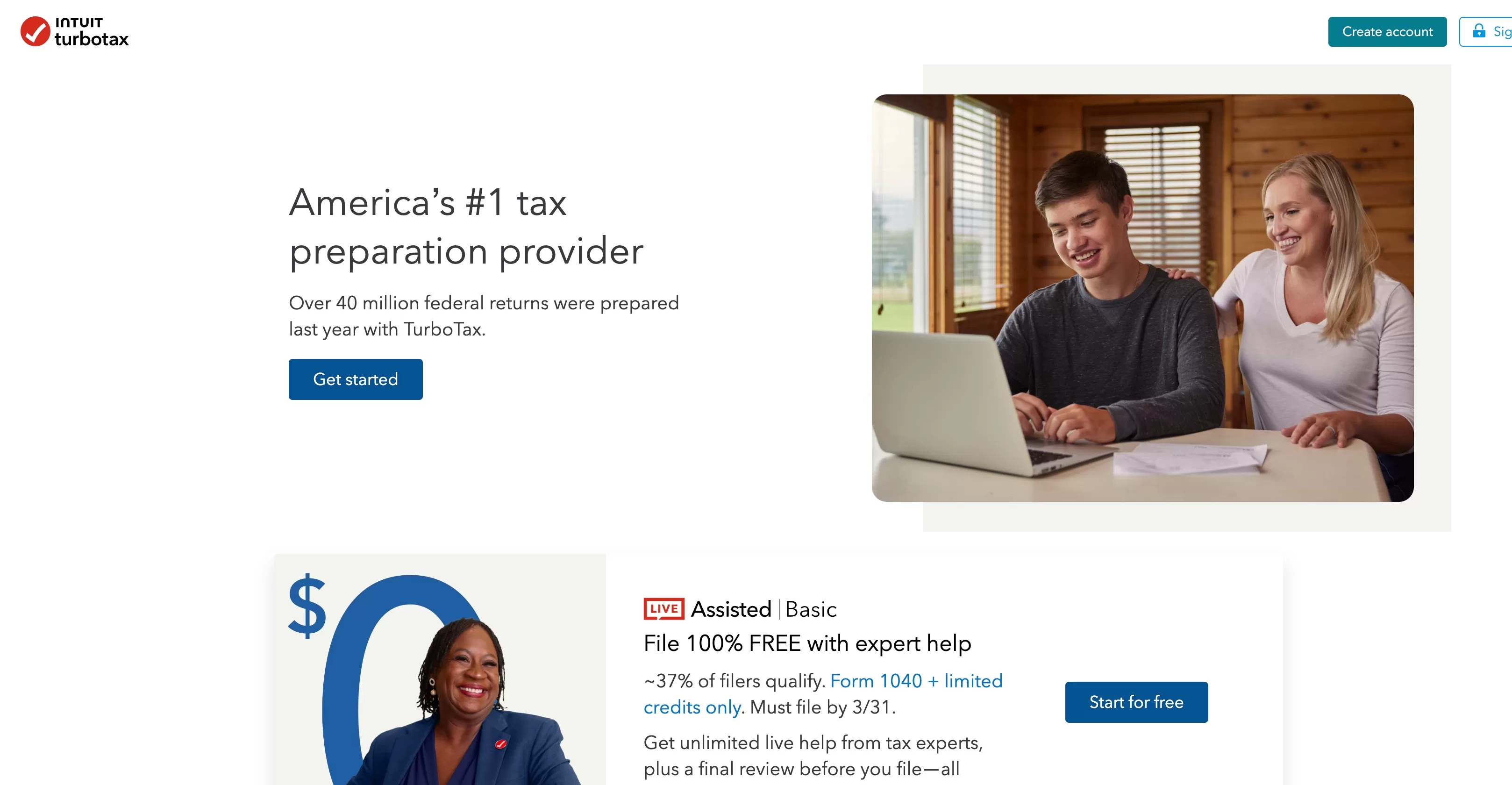

In both cases, the headlines are clear. But on the second landing page, they’re even more to the point. The 1040 is a tax form in the US, so they include that in the headline. As a visitor, I know instantly what the page is about and what I will get. There is no question.
Can you imagine if you went with a more creative headline? Something like “We make your life easier”. In a way, it’s true, right? Helping me fill in the tax form does make my life easier. But the headline would be too vague. You would have to read further to understand if this is what you were looking for.
You would end up like this headline:

It’s unclear what they do. You have to know the brand to get it or read the subtitle, which a lot fewer people will decide to read. No one has time to read, and there are plenty of competitors.
Understanding the target audience
This is important in marketing in general. You’re running ads, creating images, posts, text ads, you should know who is your target audience. Same goes for landing page. Your visuals and your copy has to be catered towards the audience you want to attract.
If your audience is people working in big companies, then your copy has to be formal, your images clean and “office-like”. I’m generalizing, of course, but this is just to get my point across. First impressions count.
If you’re targeting the same audience, check out your competitors. If they are succeeding, you can copy them and optimize later. There is no reason to reinvent the wheel every time.
Here are two pages that sell clothes. Can you guess which one sells more expensive brands?

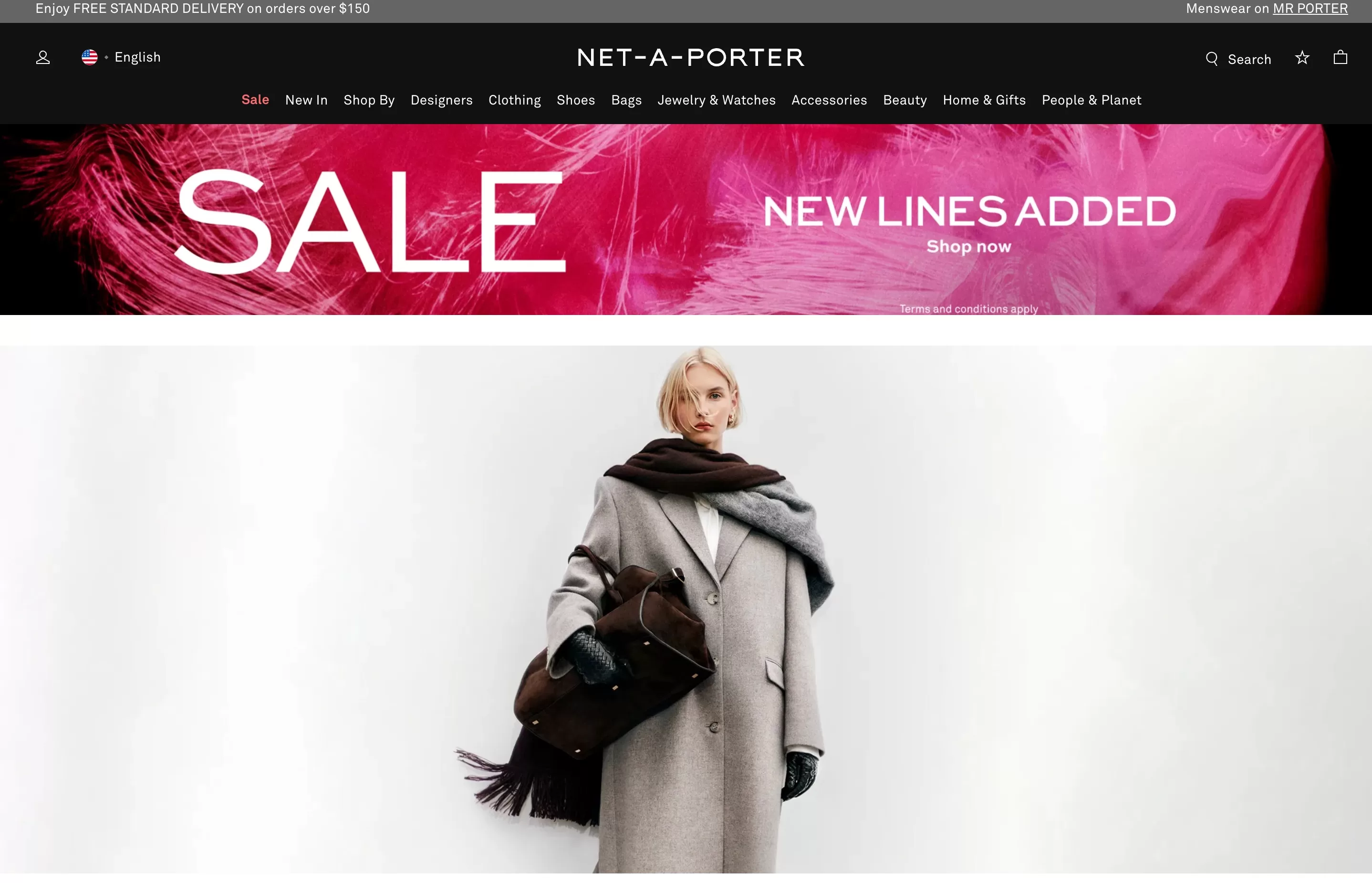
I’m sure you guessed right. The images tell a lot, and when people land on the page, they can see if the page matches their expectations. They can even see if they can afford products on a page or if the products are right for them without even looking further.
High-quality images or videos
I don’t know if I need to include this at all, but I still see landing pages with poorly cropped stock images or low-quality videos. I know that everything costs money, but this is where you can’t afford to save it. As I mentioned above, first impressions count—a lot.
There are plenty of sites where you can get premium-quality videos and stock images: Unsplash, Pexels, and Canva. To name a few.
Engaging and concise copy
I know how much you love your brand, your product, or your service. And we all want to brag about it. We think that others like to read about it as well. Well, not so much. There is one sort of rule about the length of texts (or content in general) on the landing page. The more expensive the product or service, the more convincing has to be done.
So, if you sell car oil, which costs about $30, how much convincing do you have to do? Probably not that much, right? People know what car oil is. They know they need it, and they just need to know why they should buy it from you. Usually, in this case, you use marketing tricks like free shipping, discounts, bundles, etc.
But if you sell a more expensive oil, let’s say it costs $150, you need to tell people why it’s so expensive. This means laying out everything about it: how it’s made, why it’s so special, how it helps your car engine, and so on.
Be short and to the point if there is no need for long texts. Otherwise, use simple language that anyone can understand. Bonus points if you can make long texts more engaging. Also, if there is a lot of information that has to be presented, think about a video or images. Images and sound can help you communicate your message a lot easier.
Write and rewrite many times until the landing page contains just the right amount of information, which is useful for the visitor but not overwhelming.
Strong call-to-action (CTA)
It’s probably one of the most important elements on the page. A CTA, or call to action, is how you direct users to take an action that is important to your business. Whether it’s buying, downloading, or signing up, people need to know and see what to do next.
You can revisit some of the screenshots above to see that they have a good CTA, especially the landing page about taxes.
If possible, try to keep it above the fold, meaning visible without scrolling down. As with your copy and headlines, don’t be too creative here, either. Use simple, understandable, and short phrases.
I would avoid names like “Star your journey” (unless it’s a service where you plan your journey) or even more creative ones like ” Fulfill your dreams.”
It sounds like a good emotional CTA, but what happens when I click it? This is a good rule to follow: The CTA has to reveal what will happen next. With “Fill the form,” “Get your book,” or “Sign up,” you know what will happen next, so you are less hesitant.
Remember, the CTAs are important, hence are tested a lot. If you see a creative CTA, there is a chance it has been tested and works for that business. You can copy it, of course, but there is a risk that it won’t work for you. That’s why I would start with simple, clear and direct CTA, and then, if there is a possibility test different versions.
Layout and the use of white space
I was hesitant to include this one as it’s more for designers, so I will keep it simple. Don’t try to cram everything into a small space. White space is needed between images and text for better comprehension. As I say, give it some space, let it breathe. Make it easy for the eyes to view and read your content.
Put the most important things at the top of the page, and then the rest can be below the fold.
Mobile responsiveness and cross-browser compatibility
This is a technical element, but your landing page has to work on any browser and on any device. This shouldn’t come as a surprise. It is your responsibility to check if your landing page works correctly, so before launching a campaign visits your page on at least a few browsers and both your computer and phone. This doesn’t take a lot of time.
Make sure to go through the order or sign-up process or whatever your conversion is.
Using testimonials and social proof
This is obviously optional element, but became a big part of any landing page. If your product is new you probably won’t have user reviews or ratings. At least try to get some of your friends to write a review.
Testimonials make it easier on visitors to trust your product or service and convince them to buy. If your business is unknown, there as to be something people can rely on. Comments, star ratings, testimonials (especially video ones) are a great way to show that your service or product is used and liked.
From a simple start rating:
To a testimonial with a picture, company name, and title:

Examples of Successful Landing Pages
I’ve been randomly screenshoting some of the landing pages I found, but not all of them are great examples. Let’s look at some of the pages from which you can get inspiration.

It’s a streaming service, apparently an alternative to cable TV. I haven’t heard about them before writing this post. But I like how simple, clear, and visual their landing page is.
Why do I like it?
- The headline is a quote, but it accurately describes the service. It also communicates the benefit of being “most affordable.” It’s only six words, but you definitely want to continue reading to find out what it is.
- The CTA clearly stands out, and although the text on the button is a classic “start your free trial”, it tells me what will happen next.
- Images take a big part of the page to show the selection or shows and movies. It’s easier for them as images are created by the show it self, so they did not have to think about it too much.
- If you scroll down a bit, you see the price comparison table, which shows you they, indeed, are the most affordable. And I love the clever line here “Don’t break the bank. Break up with cable.” It’s a nice play on words, but still clearly communicated.

I love new product design. Especially when it’s something that been around for ages. We have tooth brush, then electric ones popped out. What else can you do to sell something like this? How much more innovative can it get.
I assume most of these products rely on good marketing and product design. That’s why you see product displayed a lot on the page.
Why do I like it?
- Product images are cool. I’m sure it is as good for brushing as it looks. But the colors, the looks are nice. you instantly get the idea of what it is, and you either like it or not.
- Right below, you see the social proof: star reviews and then statements from various publications (I assume). This shows that it has been reviewed not only by people but also by experts.
- The headline is more creative. This is because, as I mentioned, you know what the product does. You don’t need an explanation of what the tooth brush does or what the result is. We know it. So here, you can be a bit creative and put a twist on it.

SquareSpace.com is a platform to create a website and is quite popular, so they should have a good understanding of a landing page. And they do.
Why do I like it?
- First of all they have a dedicated link to this page from the ad (https://www.squarespace.com/small-business-website/) Not sure why it’s called small business website, because what I search for on Google was “online ecommerce”. But having a dedicated page is a lot better as you can test it, you chan change whatever you want, and adopt it to your target audience.
- Simple and direct headline. No marketing fluff.
- Even though the subtitles are a bit long, they contain all the information I need.
- Clear CTA. I like to get started, there is not guessing, no anxiety about this phrase.
- I also like the image. It’s hard to pick an image for something like a website platform, but it kind of makes sense if you think about small businesses. I guess a coffee place is kind of a small business. I wonder if they tested several images and this one won.
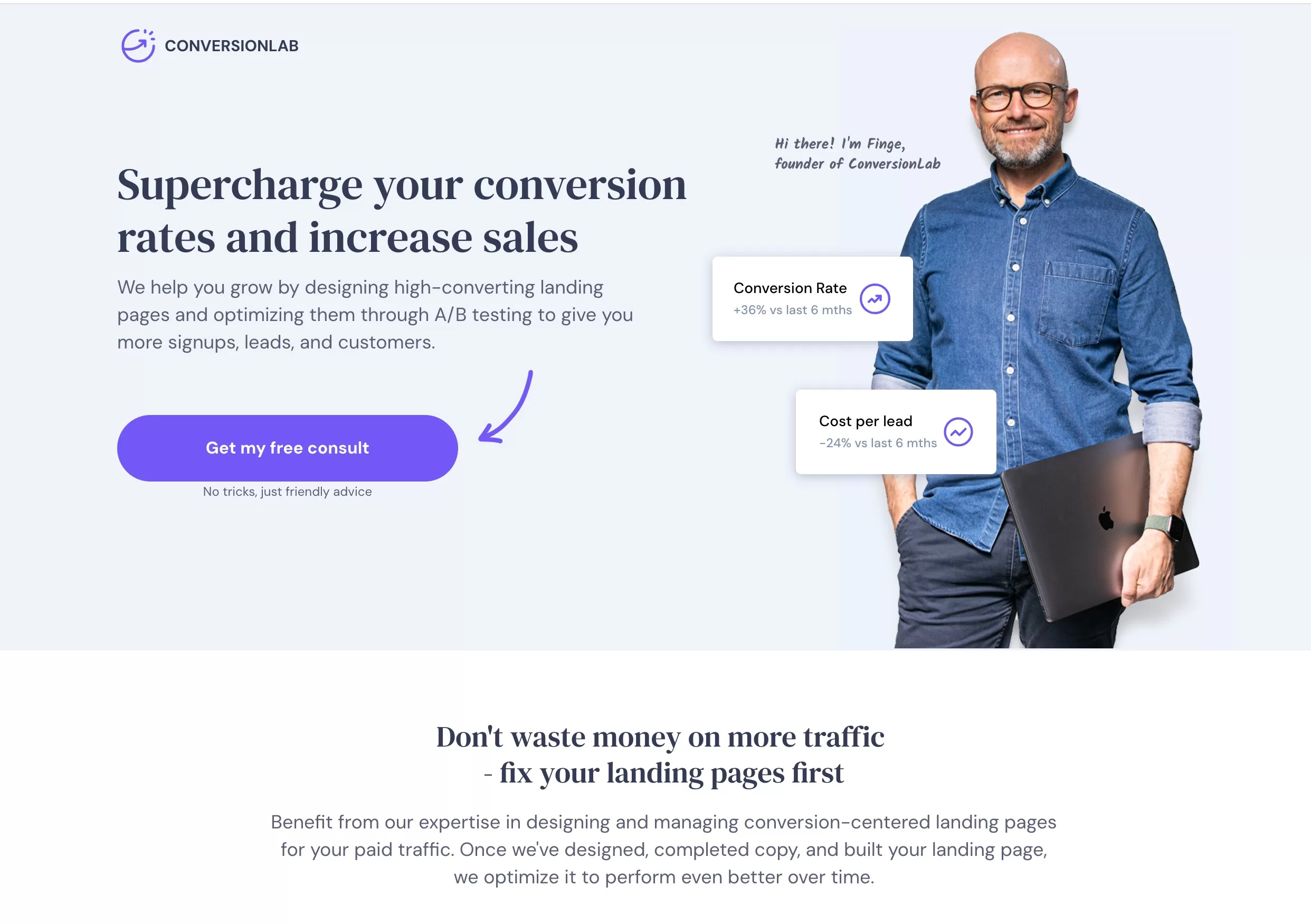
They design landing pages and increase conversions. If you provide this service, your landing page has to look good. It’s hard to check if it converts well, but I see things I like a lot.
Why do I like it?
- Personal touch. Putting founders picture is good touch. I don’t really get the two visual blocks near the picture. The idea was to show the benefits of working with them, but I would have stayed only with a picture. I think it’s even more personal. But besides that I like it. It makes the business look more friendly and approachable.
- The CTA and the arrow. Again, it’s clear and pops out. It offers a free consultation and a conversion booster, which is always nice. I also like the small subtext below the button. Adds to the whole friendliness of the page and the founder picture.
- Clean page. There is nothing else present that doesn’t communicate value to the reader.
There are a lot more pages, so you can always Google more. I recommend googling for similar products or your competitors and clicking on your ads. But not to increase their Google ads spend (lol). To see what kind of landing pages they have.
Tools and Resources for Landing Page Creation
There are a bunch of these. I will list just a few to get your started if you’re not aware at all. The rest can be googled as competitors to the ones I mentioned. I’m not affiliated with any of these, just some services I use now or used in the past.
It’s been around for a while and is a robust landing page platform. It’s not a cheap one (it starts at 89€/month), but it has a lot of great features. What I like is that you can add your domain, so the users still see your main domain and have as many custom landing pages as you want. They even have a dedicated page for PPC landing pages. It has some templates and a drag & drop editor for people like me who don’t know how to code.
This is one is similar to Unbounce but cheaper. Also, has pre-built templates and drag & drop editor. The differences are minor and will probably become visible once you start using one or the other.
It’s a WordPress plugin. I have been using this solution for a while. The biggest difference is that the pricing is not based on usage, you just pay yearly fee. And there is no limit on traffic. You also get things like pop ups and quizzes and a bunch of other stuff for the same price.
If you have even smaller budget, here’s one for you. Haven’t tried this one but it seems very similar with pre-built templates, editor and etc.
No money? No problem. Here’s a simple one-page builder for free. There aren’t a lot of features, but you get the most important one – your landing page, which works.
Each tool has its upsides and downsides and it depends mainly on what you need on what is your budget. But here are the main points to check for:
Your own domain. Ideally, you want your landing page to be on the same domain. Either landing.yourdomain.com or www.yourdomain.com/landing-page.
Integrations with other tools. Most like you will have forms, payments, email collection. Make sure the software you choose easily integrates with other tools you use or will want to use. Like Paypal or Stripe for collecting payments.
Drag & drop editor. If you’re like me, you don’t want to make changes in the code. A nice editor makes things a lot easier. You need to be able to quickly change things on a landing page.
Page Speed. Make sure that the tool provides fast landing pages. They usually brag about this on their website, but you can also write to support and ask about it.
Pre-built templates. Those can be optional, but templates are great if you want to start fast. You can start with one and then customise it to your needs, saving loads of time.
A/B testing and pop-ups. This is a great feature to have but it will be available with more expensive solutions. It’s is great to have a built-in testing tool, because if you’re serious about your business you will be testing your landing pages. And pop ups are great for collecting emails or promoting special deals on the website. Again, if they are available in the tool, that is very convenient and saves you money from opting to another tool to get the pop ups working.
Common Mistakes to Avoid
Overloading with information. This is for all content, if it does not add additional value to the user, it does not belong on the landing page. The only information that belongs on the landing page is the one that helps user make a decision to click your CTA.
Neglecting mobile users. I’ve mentioned above that you need to test your landing page, at least on your phone. But also, don’t forget about user behavior on a mobile device. If your site works fine on mobile, that’s great. But how does it look? Is everything visible clearly on a smaller screen? Does your CTA move below the fold? It’s important not only to make it work but also to make it convenient for mobile users to convert.
Weak CTAs. I have this exercise that I sometimes use to define the text on my CTA. I use the sentence “I want to …..” and then insert the CTA phrase. For example, “I want to sign up” or “I want to download the ebook“. This helps you see it from the users perspective and avoid vague CTAs.
Ignoring analytics and feedback. Having a separate landing page allows you to track it and get user feedback. Not only you can see all the click statistics and heat maps, you can also ask survey question right on the page. There is no way you can create a great landing page on your first try. You will have to improve and optimize, and you need data to do that.
Page speed. This is important for users as no one likes slow-loading pages. But Google hates it also. If you have a slow page, it can impact your Google Ads Quality Score, and that could increase your CPC and overall cost. Google has a free tool for page speed insights. Try it on your page, and if you see a lot of red, talk to your developer.
(Don’t) use your home page as a landing page. Usually, you don’t use your home page as your landing page. The biggest reason is that it is not designed for a specific action, audience, or purpose. It is usually generic. Also, you can really test it and make changes, as this is your home page. It might hurt other teams or products/services. An exception can be if you have one product/service, and your home page is your landing page. There is nothing more. Take a look at this page. It’s a screenshot tool. So, their home page can be used as a landing page because there is nothing else besides that tool. They can have separate landing pages, but if they don’t, it’s not a big deal.
Landing page for Google Ads: main points
- Landing pages are a must-have for all Google ads campaigns as they play the biggest role in converting users.
- Any advertiser platform is only responsible for driving traffic to your site. Your landing page is the one that has to finish the job.
- Understanding and creating effective landing pages is essential for campaign success.
- Design with a singular CTA to steer user actions.
- Use landing pages to deliver campaign-specific messages.
- Landing pages are ideal for A/B testing to improve performance.
- Use the tools that I mentioned to create your own landing pages easily with no coding or design skills.
- Effective landing pages have clear headlines, understand their audience, and use high-quality visuals.
- Avoid overloading info, neglecting mobile users, vague CTAs, ignoring data, and slow loading times.
- Don’t default to using the home page as a landing page; it’s not purpose-built.